 Render a House/Updated Sep 16, 2026
12 Architectural Rendering Styles Explained
Architectural rendering is not one visual language. This guide compares 12 visible styles, from photorealism to cartoon, and explains what each communicates, when to use it, how to direct it, and what can go wrong.
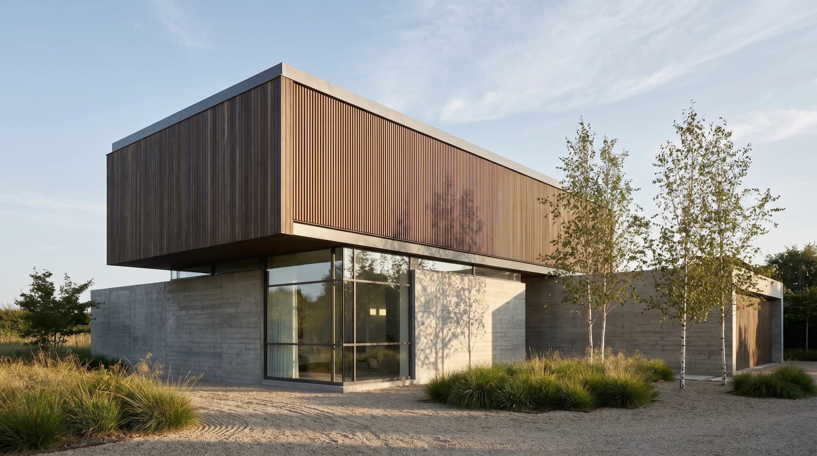
The right style is a design decision, not a finishing effect. A clay model asks people to judge massing. A collage asks them to read occupation and narrative. A photorealistic image asks them to believe the materials, light, and atmosphere. If you need examples of camera position, weather, season, and site context before choosing a visual treatment, start with these architectural rendering examples.
Which architectural rendering style should you choose?
Match the style to the decision the image must support. Early work benefits from visible abstraction; late work benefits from detail only when those details are actually resolved.
Use sketch, clay, ambient occlusion, or marker to keep a review focused on form. Use watercolor, painting, Bauhaus, collage, or cartoon to establish a point of view. Use photorealism, oil, or ink when the final image needs a more deliberate finish.
What are the 12 architectural rendering styles?
The list below contains the 12 styles named in the title and description. The images are visual references drawn from Render a House's existing idea and landing libraries; each caption identifies the cue worth carrying into a style brief.
Photorealistic
A camera-like image with plausible light, materials, reflections, depth, and environmental detail.

- Best for
- Client approvals, planning presentations, property marketing, and any late-stage image that must make the design feel buildable.
- Direct the look
- Specify the time of day, weather, lens feel, material condition, and which geometry must remain unchanged.
- Watch for
- Over-polished vegetation, impossible reflections, distorted openings, or people that pull attention away from the architecture.
Watercolour
Transparent washes, soft boundaries, paper texture, and selective detail instead of fully resolved materials.
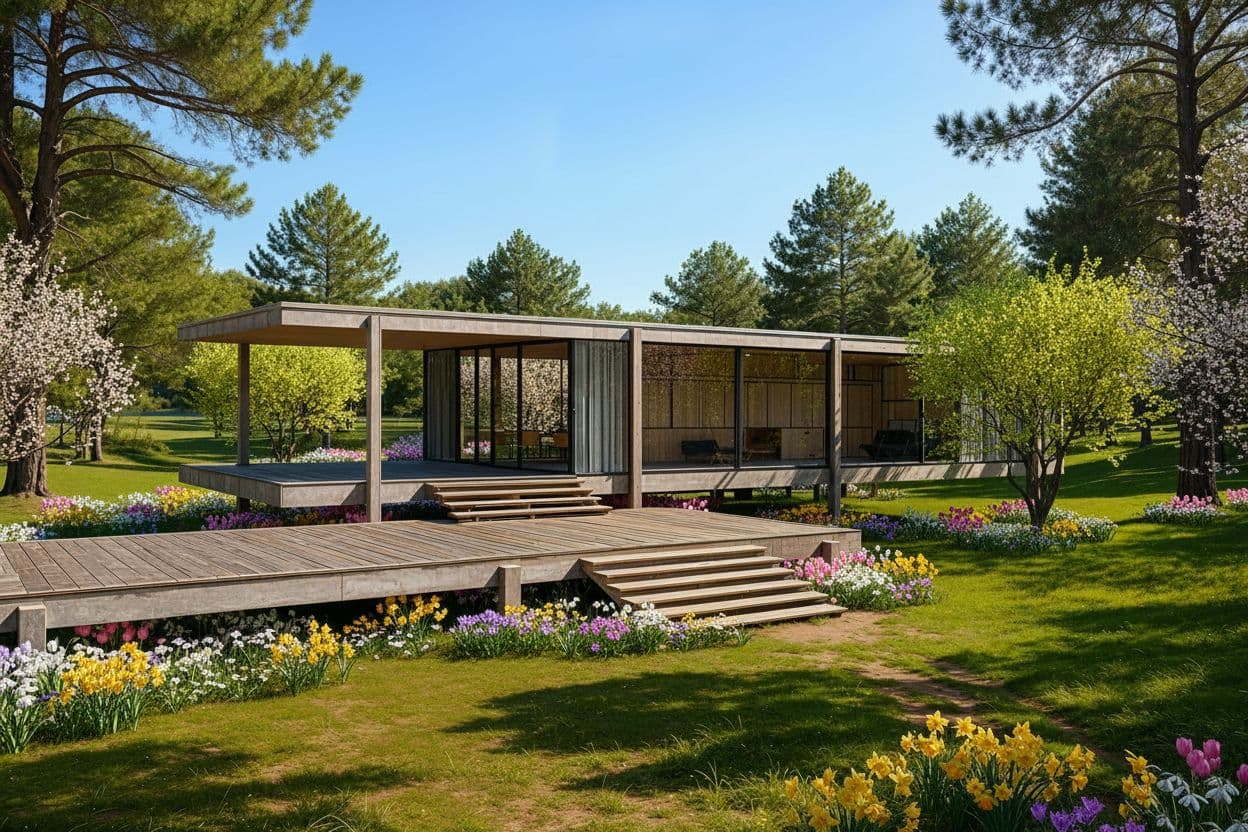
- Best for
- Concept reviews, community engagement, landscape-led schemes, and proposals that should feel open to discussion.
- Direct the look
- Ask for translucent pigment, white paper, softened vegetation, restrained linework, and clear focal areas.
- Watch for
- Uniform blur. A useful watercolor still needs a readable silhouette, hierarchy, and a few crisp edges.
Oil on canvas
Dense color, layered brushwork, visible surface texture, and strong tonal modeling that treats the image as an object.
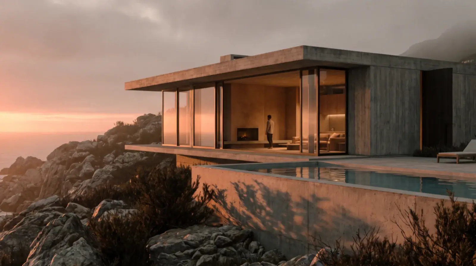
- Best for
- Competition boards, hospitality concepts, cultural projects, and a single expressive hero image.
- Direct the look
- Describe the brush scale, canvas grain, palette, edge softness, and whether the finish should feel classical or contemporary.
- Watch for
- Texture applied equally everywhere. Thick paint should reinforce light and form rather than conceal the design.
Sketch
Loose pencil or digital linework, construction marks, partial shading, and deliberate incompleteness.
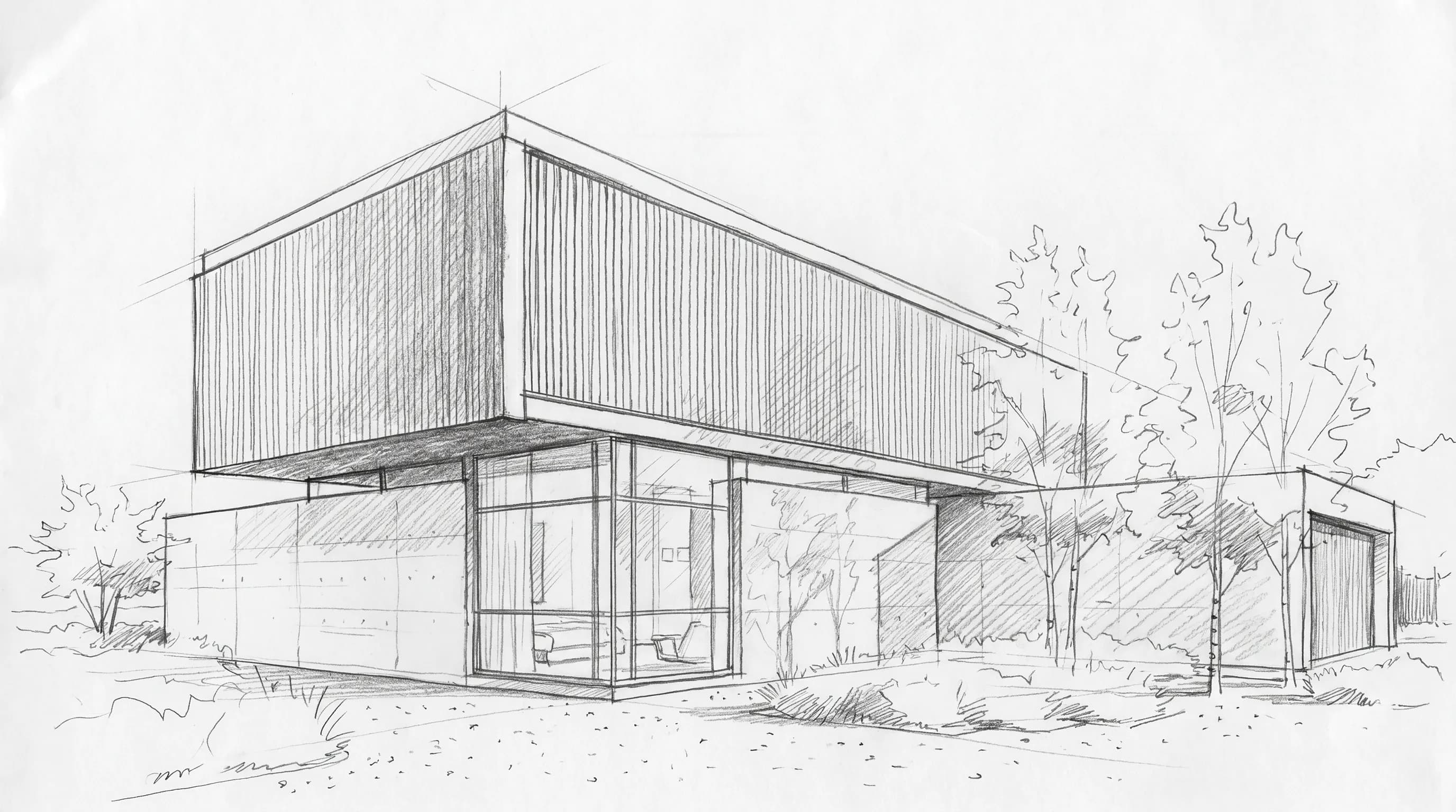
- Best for
- Massing studies, early client conversations, option testing, and any moment when a finished image would imply false certainty.
- Direct the look
- Keep the original perspective, use varied line weight, limit tonal values, and leave portions of the drawing unresolved.
- Watch for
- A sketch effect that redraws key geometry. Loose marks should not move walls, rooflines, or openings.
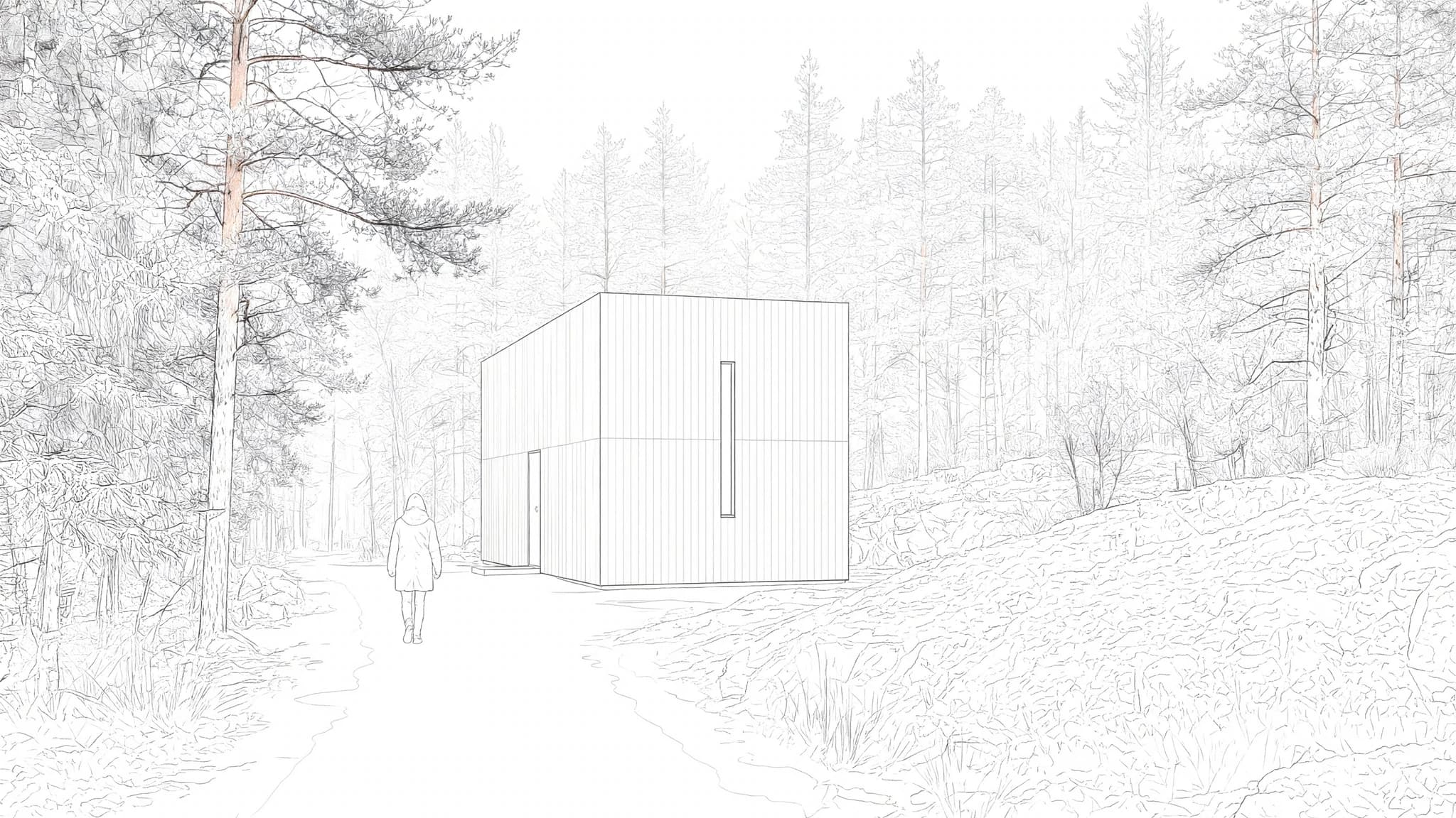
Ink illustration
Decisive black linework, controlled hatching, high contrast, and a strong relationship between solid and empty space.
- Best for
- Editorial graphics, monochrome boards, urban elevations, diagrams, and architecture with a clear silhouette.
- Direct the look
- Define primary, secondary, and detail line weights; reserve solid black for a few important shadows or surfaces.
- Watch for
- Equal-weight outlines around every object. Without hierarchy, dense ink becomes visual noise.
Painting
A broad painterly treatment that can borrow from gouache, acrylic, digital matte painting, or mixed media.

- Best for
- Narrative scenes, atmospheric masterplans, concept art, and presentations where mood matters more than material specification.
- Direct the look
- Name the medium, palette, brush character, detail level, and the part of the architecture that should stay sharpest.
- Watch for
- Using “painting” as the entire brief. A medium and visual hierarchy make the result much more predictable.
Bauhaus
Geometric planes, disciplined grids, asymmetry, reduced ornament, and color used as part of the composition.

- Best for
- Graphic concept boards, modernist projects, exhibitions, and diagrams that need a bold visual system.
- Direct the look
- Use simple geometry, a limited palette, clear typographic space, and color blocks that clarify structure.
- Watch for
- Reducing Bauhaus to red, yellow, and blue decoration. The graphic order should support the architecture.
The Bauhaus Dessau Foundation describes color in the Bauhaus Building as a material that provides orientation and can underline or override structure.
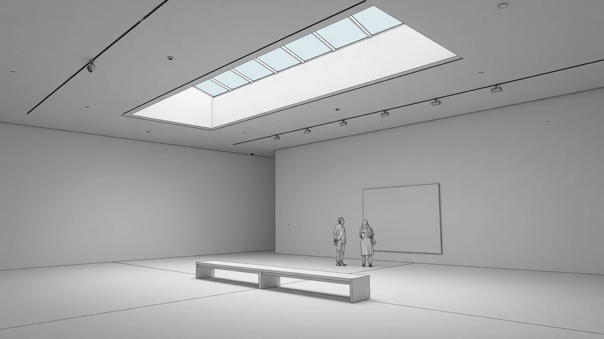
Clay or white model
A material-neutral model in white, warm gray, or card-like tones, lit to reveal form rather than finish.
- Best for
- Massing, circulation, facade depth, daylight studies, design reviews, and comparisons before materials are selected.
- Direct the look
- Remove textures, preserve clean edges, use a large soft light, and retain enough shadow to separate adjacent planes.
- Watch for
- Overexposed whites. If the brightest surfaces clip, facade depth and openings disappear.
Ambient occlusion
A mostly neutral image where corners, joints, overlaps, and contact points darken to make spatial depth legible.

- Best for
- Model checks, form studies, technical presentations, and a fast read of where surfaces meet.
- Direct the look
- Keep materials neutral, use restrained contact shadows, and preserve a wide tonal range instead of crushing the image to gray.
- Watch for
- Dirty-looking creases. Ambient occlusion is a depth cue, not a substitute for direct light and realistic shadow.
The Blender manual defines ambient occlusion by how much the hemisphere above a shading point is occluded.
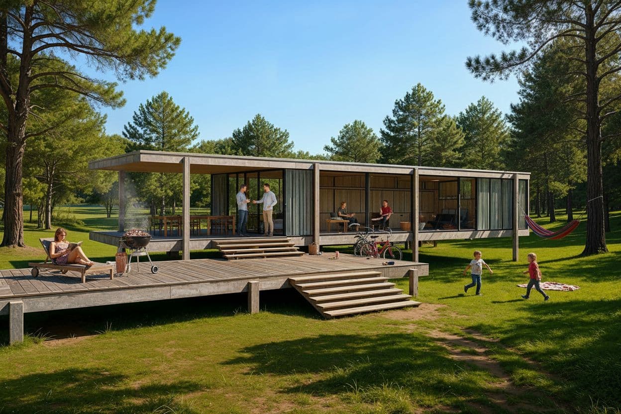
Collage
Cutout people, plants, skies, textures, drawings, and rendered fragments assembled into one deliberately layered image.
- Best for
- Competitions, urban proposals, social narratives, masterplans, and boards that combine evidence with imagination.
- Direct the look
- Choose one perspective system, one shadow direction, a controlled paper texture, and a consistent scale for cutout elements.
- Watch for
- Mismatched horizons, inconsistent lighting, and people or trees whose scale makes the architecture impossible to read.
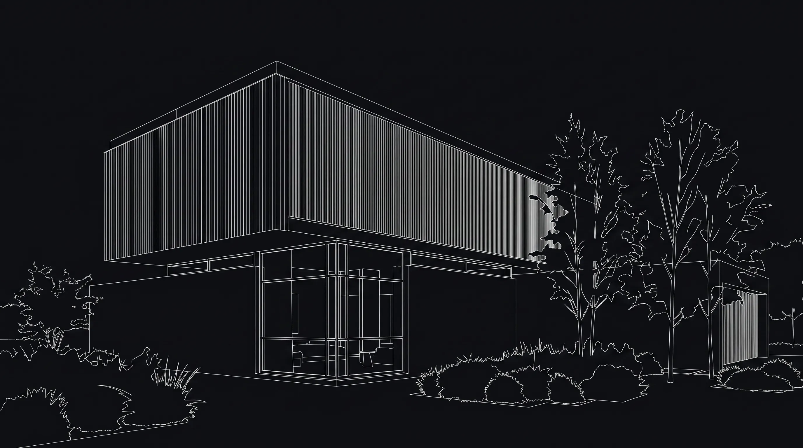
Marker
Visible linework with broad translucent color strokes, quick shadows, and the energy of a design-studio pin-up.
- Best for
- Charrettes, facade color studies, interior concepts, teaching, and fast options that still feel authored.
- Direct the look
- Keep a crisp pen base, limit the marker palette, overlap strokes intentionally, and leave some white paper visible.
- Watch for
- Filling every surface. Marker drawings work because the color is selective and the linework remains active.
Cartoon
Simplified shapes, flat or lightly shaded color, clear outlines, and exaggerated hierarchy for immediate readability.

- Best for
- Public explainers, storyboards, education, wayfinding concepts, playful brands, and presentations for non-specialist audiences.
- Direct the look
- Set the outline weight, color count, amount of exaggeration, and whether people and landscape should match the same visual language.
- Watch for
- Losing dimensional cues. Even a playful image needs consistent perspective, scale, and a clear ground plane.
How do rendering software styles and presets differ?
“Style” can mean a render preset, a saved effect stack, a linked group of visual settings, an AI post-process, or a reference image. The name alone does not tell you whether geometry, materials, lighting, or only the finished pixels will change.
| Software | Style mechanism | Useful when | Boundary to know |
|---|---|---|---|
| Render a HouseStyle guide | Built-in styles plus an uploaded reference image used as a custom style. | You want to test a visual treatment on an architectural upload while keeping the project and render history together. | Its own guide warns that the Real photo style can force stronger drawing changes; prompt-directed realism is safer when geometry fidelity is the priority. |
| EnscapeSettings preset documentation | Visual Settings can be saved as presets and linked to saved views. | You need to recall the same camera and visual-settings combination for single images or batch rendering. | A linked preset takes precedence over the current global Visual Settings for that view. |
| LumionCustom Styles documentation | Custom Styles save a reusable effect stack in the Styles library. | A studio wants repeatable atmosphere and color grading across projects or workstations. | Lumion documents that a Custom Style saves effects, not imported models, materials, or objects, and works in Photo and Movie modes. |
| D5 RenderAI post-processing documentation | AI Style Transfer applies stylized or realistic treatments after rendering. | You want watercolor, cartoon, scale-model, pen, pencil, voxel, seasonal, or time-of-day variants without rebuilding materials. | It is an AI post-processing workflow applied to rendered images, not a substitute for the underlying scene setup. |
Compare the mechanism before comparing thumbnail galleries. A reusable settings preset solves consistency; a reference image solves art direction; a post-process solves presentation variety. They are related, but not interchangeable.
How can you compare styles without losing the design?
- Freeze the design. Use the same model revision, camera, crop, and output ratio for every comparison.
- State the invariant. List the walls, rooflines, openings, furniture, or landscape elements that cannot move.
- Change one visual variable. Switch the style while holding time of day, weather, and camera direction steady.
- Judge communication, not novelty. Ask whether the image helps the audience decide on form, material, mood, occupation, or final approval.
- Carry one winner forward. Refine the selected style instead of averaging incompatible looks into a muddy brief.
A fair style test keeps the architecture constant. If the roof, openings, camera, and landscape all change at once, you are comparing redesigns rather than rendering styles.
How do styles work in Render a House?
Render a House's first-party style guide documents built-in photoreal, line drawing, blueprint, painterly, atmospheric, and seasonal choices. It also supports an uploaded reference image as a custom style, which guides materials, palette, and mood.
The same guide sets an important boundary: an uploaded style is a reference, not model fine-tuning or training. It also recommends avoiding the built-in Real photo style when strict geometry fidelity matters, and describing the desired realism in the prompt instead.
Test one architecture view in a different visual language.
Keep the design fixed, choose a style, then refine the result.
What do architects ask about rendering styles?
How many architectural rendering styles are covered here?
Twelve: photorealistic, watercolor, oil on canvas, sketch, ink illustration, painting, Bauhaus, clay or white model, ambient occlusion, collage, marker, and cartoon. Each appears as a numbered style item with a visual reference above.
What is the best rendering style for an early design?
Sketch, clay, ambient occlusion, and marker treatments usually communicate that the design is still developing. They reveal form and intent without making every material or landscape decision look final.
What is the best architectural rendering style for clients?
Use photorealism when the client must judge materials, light, and atmosphere. Use watercolor, collage, or sketch when the conversation should stay focused on concept and direction rather than finished specification.
Can one project use more than one rendering style?
Yes. A project can move from sketch or clay during design, to collage or painting for narrative, and to photorealism for final approval. Keep the camera and geometry stable when comparing styles so the visual treatment is the variable.
Is ambient occlusion a complete lighting style?
Not usually. It is most useful as a contact-shadow and depth cue. A presentation image still needs a deliberate lighting hierarchy if it must communicate time, weather, material, or realism.
Which architectural rendering style is right for your project?
Choose the style that makes the next design decision easier. Sketch, clay, and ambient occlusion expose form. Watercolor, painting, Bauhaus, collage, marker, and cartoon frame interpretation. Photorealistic, oil, and ink treatments deliver a more resolved visual statement.
Then test it against the same view. The strongest style is not the one with the most detail; it is the one that helps the intended audience read the architecture without mistaking visual finish for design certainty.
Keep reading
Related guides and comparisons
20 Best AI Interior Design Tools in 2026 (Free & Paid)
Compare 20 AI interior design tools for room redesign, architecture, floor plans, virtual staging, and client renders, with vendor-sourced prices and tradeoffs.
How to Render in SketchUp: A Practical Workflow Guide
Learn how to render in SketchUp with native viewport tools, in-app plugins, external renderers, Photoshop, Mac workflows, and free options for architects.
How to Render in Revit 2027: Native, Twinmotion, and Export Workflows
Learn how to render in Revit 2027, export a finished raster image, open a view in Twinmotion, or use FBX plus conversion when you need GLB, glTF, or OBJ.
