 Render a House/Updated Oct 18, 2026
Office Interior Design Ideas: Modern Layouts, Materials and Renders
Fourteen office interior design ideas, from activity zones and acoustic baffles to small-office tricks, each with when it works and when to skip it. Render a House lets you try any of them on a photo, plan or 3D model of your own office before you buy a thing.
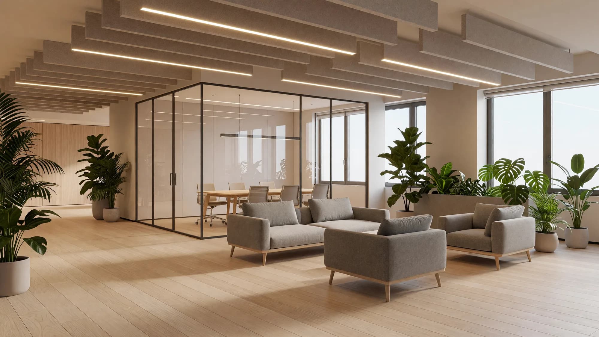
The office interior design ideas that hold up in 2026 solve a working problem first and a style problem second: zone the floor by activity, control noise with visible acoustic treatment, glaze the meeting rooms, and get every desk right before choosing finishes. Warm wood, planting, layered light and one accent color then make the space feel modern. Render a House, an AI rendering tool for architects and designers, renders any of these ideas onto a photo, exported plan or 3D model of your own office in about 30–60 seconds, so you can compare directions before committing to them.
Every idea below has a short explanation, the situations where it works, and the situations where it does not. Dimensions come from the ADA 2010 Standards and OSHA guidance, linked at the point of use and checked October 2026.
What are the best office interior design ideas right now?
Quick answer: the strongest office interior design ideas are activity zones (focus, collaboration, social), visible acoustic treatment, glass-walled meeting rooms, phone booths, warm wood with soft neutrals, planting and views, layered lighting, one accent color, furniture that moves, and ergonomic desks. For a small office, keep one light palette, use glass partitions and wall-mounted storage, and keep a 36 in (915 mm) clear main path. To see an idea on your own space, upload a photo or model to AI office design and describe the change in plain words.
| Idea | Works best for | Skip it when |
|---|---|---|
| Zone by activity | Hybrid teams that mix calls, focus work and meetings | Every desk is used the same way all day |
| Acoustic baffles and felt | Open plans with hard floors and glass | Rooms already carpeted with an acoustic tile ceiling |
| Glazed meeting rooms | Deep floor plates where inner rooms would be dark | Confidential work that needs full visual privacy |
| Warm wood and soft neutrals | Client-facing studios, agencies, professional services | Heavy-wear workshops or labs |
| Planting and views | Any office with daylight and someone to care for plants | Windowless rooms with no maintenance budget |
| Layered lighting | Every office; it matters most in screen-heavy work | Never skip; scale it down instead |
| Dark focus zone | Engineering, editing, writing, call-heavy teams | Small offices that already feel cramped |
| Lounge hub | Teams that come in to meet rather than to sit | Offices where everyone needs a fixed desk |
| Statement reception | Offices with regular client or candidate visits | Back offices nobody visits |
| Phone booths and small rooms | Open plans with frequent video calls | Private-office layouts |
| Exposed structure | Lofts, concrete or timber buildings, high ceilings | Low ceilings, or buildings with messy services |
| One accent color | Brands with a strong color; neutral shells | Interiors that already mix many colors |
| Furniture that moves | Growing teams, event-heavy spaces, small offices | Fixed lab or trading-floor layouts |
| Desk-first ergonomics | Every office with people at screens | Never skip |
What is office interior design?
Office interior design is the planning of a workplace's interior: how the floor is divided, which furniture goes where, and the materials, color, lighting and acoustics that shape how the space works and feels. It sits between space planning (desk counts, circulation, adjacencies) and decoration (finishes and objects).
It differs from an office layout. A layout answers where things go; interior design also answers what they are made of and how they feel. If you are still deciding where teams, rooms and desks sit, start with office layout ideas. Office design is also one branch of commercial interior design, which covers retail, hospitality and other non-residential spaces.
Interior office design is therefore a set of decisions, not a style. The ideas below are grouped as decisions you can test one at a time.
Which 14 office design ideas are worth trying?
The first three ideas change how the office works, the middle ones change how it feels, and the last ones protect the people sitting in it. Most good offices combine four to six of them, not all fourteen.
1. Zone the floor by activity, not by department
Activity-based zoning divides the floor by what people do rather than by team: quiet focus desks, a collaboration area with tables and screens, a social zone near the kitchen, and enclosed rooms for calls and meetings. Noisy zones sit near the entrance and kitchen; quiet ones sit at the far end, away from circulation.
- When it works: hybrid teams whose people switch between calls, focus work and meetings during a day, and offices where attendance varies.
- When to skip it: every person does the same kind of work at a fixed desk all day; a well-planned row of desks may serve them better.
2. Hang acoustic baffles and felt panels
Modern offices are full of hard surfaces: glass, concrete, timber. Felt baffles hung from the ceiling and fabric wall panels absorb sound that those surfaces reflect, and they double as a design element in color and rhythm. Baffles also work with exposed ceilings, where an acoustic tile ceiling is not an option.
- When it works: open plans with hard floors, high ceilings or a lot of glass, and any office where people take calls at their desks.
- When to skip it: the room is already carpeted with a sound-absorbing tile ceiling and is not noisy; adding more felt only adds cost.
3. Glaze the meeting rooms
Glass-walled meeting rooms with a slim black or bronze frame keep daylight moving into the middle of the floor and make the office feel larger. They also signal whether a room is free. Add frosted manifestation at eye level and blinds for confidential meetings.
- When it works: deep floor plates where solid inner rooms would be dark, and offices that want an open, transparent feel.
- When to skip it: meetings are routinely confidential (HR, legal, medical); specify solid or acoustically rated walls instead.
4. Warm wood with soft neutrals
Warm minimalism pairs oak or ash with warm white walls, grey or oatmeal textiles and a few black metal details. It is the default look of many modern office interiors because it reads as calm and premium, and it ages better than a trend color.
- When it works: agencies, studios, law and finance offices, and any space that hosts clients.
- When to skip it: the space is a workshop, lab or warehouse office where finishes take heavy wear; durable sealed concrete and steel will last longer.
5. Bring in planting and views
Biophilic design brings nature into the space: planting, views out, natural materials and daylight that changes through the day. Terrapin Bright Green's 14 Patterns of Biophilic Design (checked October 2026) groups these into patterns such as Visual Connection with Nature, Dynamic & Diffuse Light, Material Connection with Nature, Prospect and Refuge, which is a useful checklist for a brief.
- When it works: offices with daylight and a plan for plant care, whether a staff member or a maintenance contract.
- When to skip it: the plants will not be maintained; dying planting looks worse than none. Use natural materials and views instead.
6. Layer the lighting
Layered lighting combines ambient light (linear fixtures, often run along the baffles), task light at desks, and accent light on walls, art or the reception. Warmer color temperatures suit lounges and social zones; neutral light suits desks. OSHA's computer workstation guidance recommends placing monitors perpendicular to windows to cut glare, so plan lighting and desk orientation together.
- When it works: every office. It matters most where people spend long hours at screens.
- When to skip it: never skip it; on a small budget, keep the ambient grid and add a few task lamps.
7. Build a darker, quieter focus zone
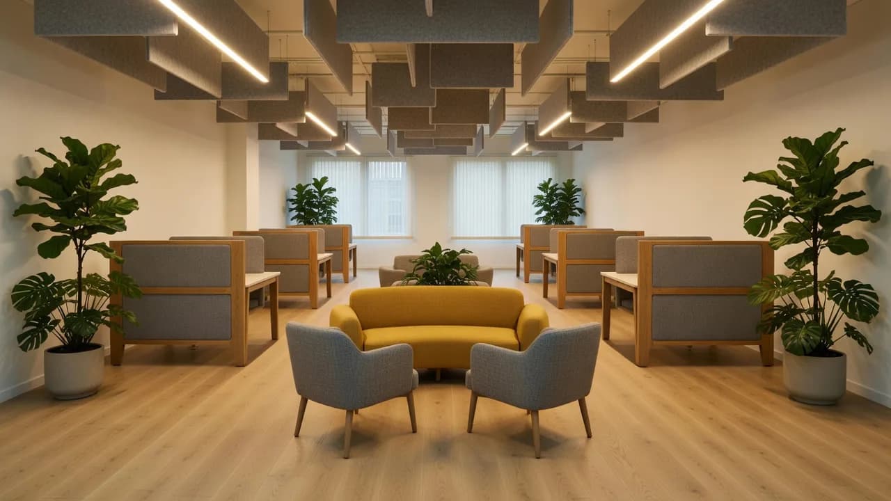
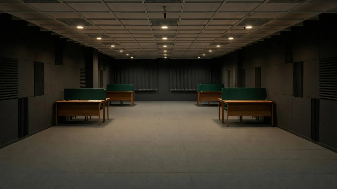
A focus zone uses darker, saturated colors, soft acoustic wall panels, individual desks with low screens and warm, dim lighting. Darker surfaces reflect less light and make a room feel more enclosed, which helps concentration. It works best as one zone of the floor, not the whole office.
- When it works: engineering, editing, writing and call-heavy teams, or a quiet room within a busy open plan.
- When to skip it: the office is small and short on daylight; a dark palette across the whole room will make it feel cramped.
8. Replace a desk row with a lounge hub
When people come in to meet rather than to sit, a lounge hub of sofas, armchairs and a central planter often does more than another row of desks. Pair it with the collaboration zone and keep it away from the focus desks.
- When it works: hybrid teams with low daily attendance, and offices that host events or all-hands meetings.
- When to skip it: everyone needs an assigned desk every day; lounge seating rarely suits laptop work for a full day.
9. Make the reception do the branding
The reception is the one place where a bolder statement pays off: a solid timber or stone counter, a double-height space if you have one, and a wall that carries the brand. Visitors judge the company here, and staff pass it twice a day.
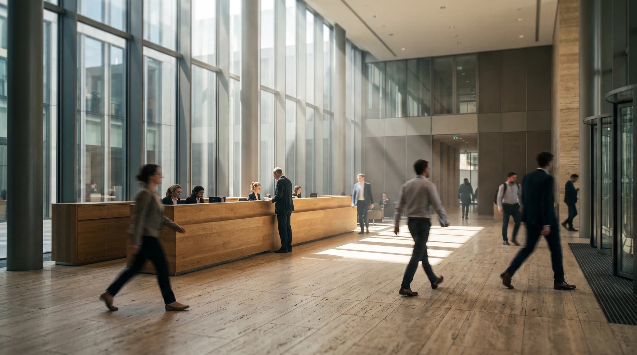
- When it works: offices with regular client, candidate or partner visits, and shared buildings where tenants compete for attention.
- When to skip it: nobody visits; spend the budget on the work floor instead.
10. Add phone booths and small rooms
Phone booths, one- and two-person pods and small focus rooms give calls a place to go, so the open floor stays quiet. Freestanding booths can move with the layout; built rooms give better acoustic separation and can take a door, light and ventilation like any other room.
- When it works: open plans where people take frequent video calls.
- When to skip it: the layout is already mostly private offices.
11. Expose the structure and services
Removing a suspended ceiling to expose concrete slabs, timber beams or painted services adds height and character. In timber buildings, the structure becomes the main finish, as in an atrium with exposed glulam trusses. It pairs naturally with acoustic baffles, which replace the absorption the tile ceiling used to provide.
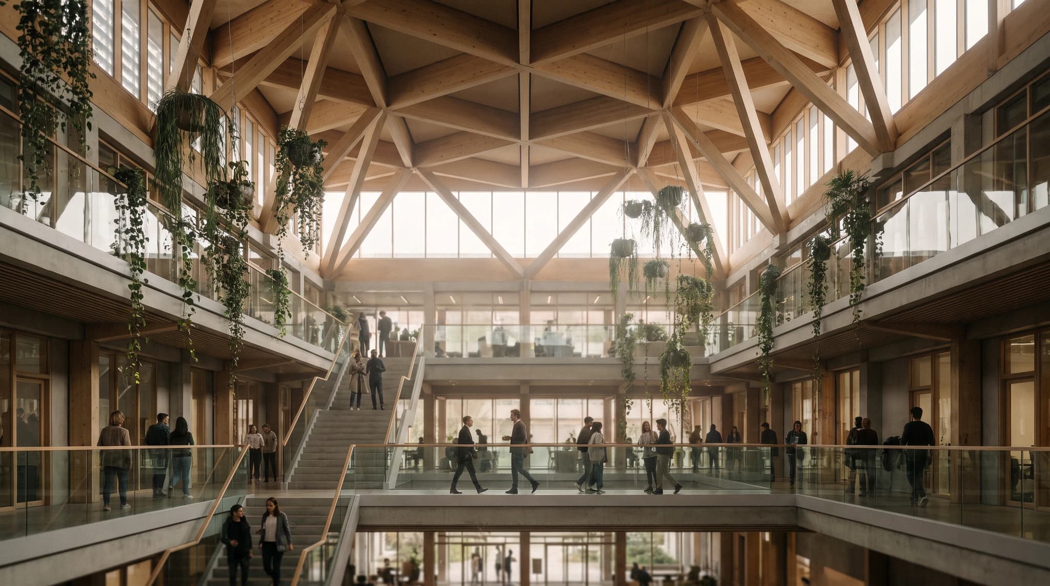
- When it works: lofts, concrete or timber buildings, and floors with generous ceiling height.
- When to skip it: the ceiling is low or the services above are disorganized; check with the landlord and an engineer before removing a ceiling.
12. Use one accent color, sparingly
A neutral shell with one accent color, applied to a few large pieces such as a sofa, a booth, a felt panel or a stair, looks deliberate and on-brand. Spread the same color across every surface and it starts to look like a trade-show stand.
- When it works: brands with a strong color, and neutral interiors that need a focal point.
- When to skip it: the space already mixes many colors and materials; remove before you add.
13. Choose furniture that moves
Tables on casters, stackable chairs, mobile whiteboards and freestanding storage let a team rearrange a floor for a workshop or a growing headcount without a contractor. They also make it easier to test a layout before fixing it.
- When it works: growing teams, small offices and spaces that host events.
- When to skip it: the layout is fixed by equipment, power or data, such as labs or trading desks.
14. Design the desk before the decor
Every idea above fails if the desk does not work. Plan an adjustable chair, a work surface at a usable height and a correctly placed monitor for each workstation. OSHA's eTool recommends putting the monitor directly in front of you, at least 20 inches away, with the top line of the screen at or below eye level. For accessible work surfaces, the ADA 2010 Standards (§902.3) set the top between 28 and 34 inches above the floor.
- When it works: every office with people at screens.
- When to skip it: never skip it.
What are good small office design ideas?
Small office design ideas are mostly about keeping the floor and the walls visually continuous so the room reads as one space. These work in a home office, a two-person studio or a 10-person suite:
- Use one light, consistent palette. Two or three materials, such as oak, warm white and grey textile, repeated across floor, walls and furniture.
- Choose glass over solid partitions. A glazed meeting room or focus room shares daylight with the rest of the office.
- Build storage full height or wall-mounted. Floor-to-ceiling cupboards in the same finish as the walls disappear; scattered low units clutter.
- Pick furniture on legs or casters. Seeing floor beneath furniture makes a room feel bigger, and mobile pieces let one room serve several uses.
- Keep the main path clear. 36 inches (915 mm) is the ADA minimum clear width for an accessible route (§403.5.1); treat it as a floor, not a target.
- Add one acoustic surface. A felt wall panel or a rug stops a small, hard room from echoing during calls.
- Light the walls, not just the desk. Wall washing or a few accent lights push the perceived edges of a small room outward.
Skip the dark focus zone and the statement reception in a small office: both need room to work.
Which materials suit a modern office interior?
A modern office interior usually relies on a short list of materials. The table lists where each one works and what to check before specifying it.
| Material | Where it works | What it adds | Watch out for |
|---|---|---|---|
| Oak or ash (solid or veneer) | Floors, desk tops, wall slats, reception counters | Warmth and a premium read in renders and in person | Scratches on desks; check finish durability and fire rating for wall linings |
| Carpet tile | Open-plan floors, focus zones | Absorbs footfall noise; single tiles can be swapped | Looks flat in photos unless paired with timber or rugs |
| Polished or sealed concrete | Lofts, cafes, entrances | Durable and honest in an industrial shell | Hard and loud; plan acoustic treatment on the ceiling or walls |
| Acoustic felt (PET or wool) | Ceiling baffles, wall panels, desk screens | Adds color and texture while absorbing sound | Ask the supplier for tested absorption data and fire classification |
| Glass with a slim black or bronze frame | Meeting rooms, focus rooms, partitions | Shares daylight and keeps sight lines open | Low acoustic privacy unless specified for it; add manifestation and blinds |
| Textured upholstery (boucle, wool blends) | Lounge seating, booths | Softens a hard shell and reads well on camera | Pick commercial-grade fabrics; residential ones wear fast |
| Painted plaster in warm white or greige | Walls and ceilings | A calm backdrop that lets one accent color work | Pure cool white can feel clinical under daylight-balanced LEDs |
Ask suppliers for tested performance data, such as acoustic absorption, fire classification and wear rating, rather than relying on how a material looks in a photo or a render.
Which dimensions should an office design respect?
Good-looking office ideas still have to fit people moving through the space. In the US, the ADA 2010 Standards for Accessible Design set minimum dimensions for routes, doors and work surfaces, and OSHA publishes workstation guidance. The figures below are starting points for a concept, not a substitute for a code review by a professional for your jurisdiction.
| Item | Figure | Source |
|---|---|---|
| Accessible route clear width | 36 in (915 mm) minimum | ADA 2010 Standards §403.5.1, which allows short 32 in pinch points under conditions (ada.gov, checked October 2026) |
| Turning space (T-shaped) | Within a 60 in (1525 mm) square, arms and base 36 in wide minimum | ADA 2010 Standards §304.3.2 (ada.gov, checked October 2026) |
| Door clear opening | 32 in (815 mm) minimum | ADA 2010 Standards §404.2.3 (ada.gov, checked October 2026) |
| Accessible work surface height | 28 in (710 mm) to 34 in (865 mm) above the floor | ADA 2010 Standards §902.3 (ada.gov, checked October 2026) |
| Monitor position | Directly in front, at least 20 in away, top line at or below eye level, perpendicular to the window | OSHA Computer Workstations eTool, monitors (osha.gov, checked October 2026) |
Employee work areas have their own rules: the ADA 2010 Standards (§203.9) require them to be designed so people with disabilities can approach, enter and exit, with fewer requirements inside the work area itself. A designer or architect should confirm what applies to your project.
How do you pick ideas for your type of office?
Match the ideas to the office you have and the way the team uses it. Start from the row closest to your situation:
| Type of office | Start with | Usually avoid |
|---|---|---|
| Small office (2–10 people) | Furniture that moves, one accent color, glazed partition, desk-first ergonomics | Dark focus zone, statement reception |
| Hybrid team that comes in to collaborate | Zone by activity, lounge hub, phone booths, acoustic baffles | Rows of identical assigned desks |
| Focus-heavy team (engineering, editing, finance) | Dark focus zone, acoustic felt, layered lighting, desk-first ergonomics | Large open lounge at the center of the floor |
| Client-facing studio or agency | Statement reception, warm wood, glazed meeting rooms, planting | Exposed services in a low ceiling |
| Loft or industrial building | Exposed structure, concrete with acoustic baffles, one accent color | Heavy suspended ceilings that hide the shell |
How do you see an office design idea before building it?
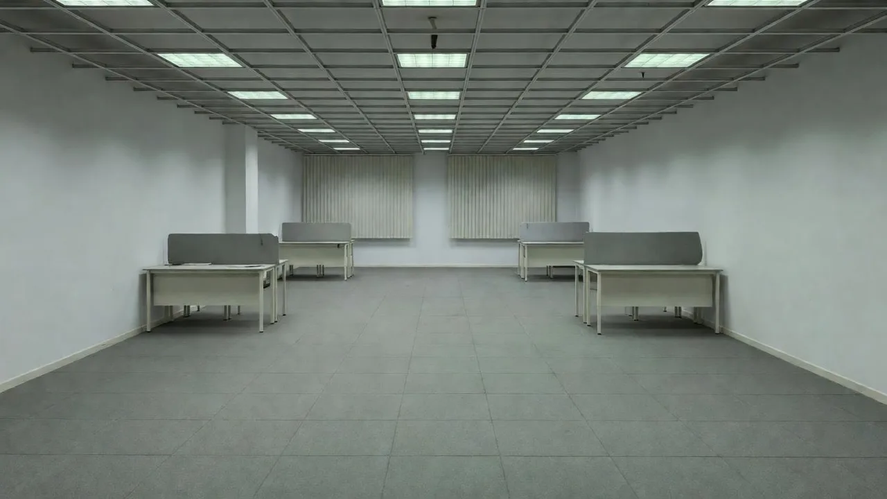
The fastest way to judge an office design idea is to see it on your own space. Render a House renders a concept from what you already have: a photo of the office, a plan or sketch, or a 3D model.
- Pick the input. Upload a straight, well-lit photo of the office as PNG, JPG or WebP. Plans and sketches work too; if the plan is a PDF, export the page to PNG or JPG first. If you have a model, upload the SketchUp
.skpdirectly, or a GLB, GLTF, OBJ or STL file, and frame the view in the 3D preview (see supported file formats). - Say what must not change. Name the walls, windows, columns, ceiling height and camera so the result stays recognizable.
- Test one idea per round.For example: “add grey felt ceiling baffles with linear lights, oak floor and large plants; keep the desks and windows.”
- Regenerate or edit. Generate a new version for a broad change of style; use Edit this image on a selected area to swap one finish or add a phone booth, as described in refine and iterate.
- Compare and share. Put two or three versions side by side, next to the original photo, so the team sees what is existing and what is proposed.
The Free plan gives 3 credits a day at 1K with a watermark and no card; a Standard 1K render costs 1 credit. Paid plans start at $19/month for Basic with 120 credits, and Pro is $39/month with 240 credits; video is on paid plans only. Estimate a project with the render cost calculator or see the plans and pricing docs.
Render your own office concept from a photo, plan or 3D model and compare two of the ideas above on the same view.
What can't an idea gallery or a render tell you?
An idea gallery shows what is possible, not what fits your lease, budget or building. Ceiling heights, services, landlord rules, fire separation and code requirements decide which ideas survive.
A rendered concept has its own limits. Render a House is an AI rendering tool, not CAD or space-planning software: it interprets the image or model you give it, so it can shift a column, change window spacing or invent a piece of furniture. Do not use a render for desk counts, occupancy, egress, accessibility checks or construction. Keep the measured plan or model as the source of truth, and review acoustics, lighting levels, ergonomics and services with the right specialists before anything is bought or built.
Where should you read next?
- Office layout ideas — where to put desks, rooms and zones before choosing finishes.
- Commercial interior design — how office design fits within retail, hospitality and other commercial work.
- AI office design — render an office concept from your own photo, plan or 3D model.
- AI interior design generator — the same workflow for any interior.
- AI interior design tools — how AI tools for interiors compare.
- Rendering styles — lighting, camera and style options for presenting a concept.
- Floor plan to render workflow — turn an exported office plan into a visual.
Where do the figures on this page come from?
- 2010 ADA Standards for Accessible Design — §304.3.2, §403.5.1, §404.2.3, §902.3 and §203.9 (checked October 2026)
- OSHA Computer Workstations eTool: monitors — monitor distance, height and orientation (checked October 2026)
- Terrapin Bright Green, 14 Patterns of Biophilic Design — pattern names (checked October 2026)
Render a House figures come from the plans and pricing docs. Images on this page are Render a House example images or the input photo used to make them.
What do people ask about office interior design?
What are the best office interior design ideas for 2026?
- Start with ideas that fix how the office works: zone the floor by activity, treat acoustics with baffles and felt, add phone booths, and get desk ergonomics right. Then add the ideas that change how it feels: warm wood with soft neutrals, planting and views, layered lighting and one accent color. You can test any of them on a photo or 3D model of your own office with Render a House before buying anything.
What does a modern office interior look like?
- A modern office interior usually combines an open but zoned floor, glass-walled meeting rooms, acoustic treatment that is visible as a design element, warm natural materials such as oak, soft upholstered seating, planting and layered lighting. It looks calmer and more residential than a 2000s cubicle floor, and it offers a choice of places to work instead of one desk per person.
How do I design a small office so it feels bigger?
- Keep one light, consistent material palette; use glass rather than solid partitions; mount storage on walls or build it full height; choose furniture on legs or casters so the floor reads as continuous; and keep circulation clear. Accessible routes need 36 inches (915 mm) of clear width under the ADA 2010 Standards, which is also a good working minimum for any main path.
How much does office interior design cost?
- There is no reliable single figure: cost depends on floor area, location, whether walls and services move, and the furniture specification, so get quotes from local designers and fit-out contractors for your space. Visualizing ideas first is inexpensive. Render a House has a Free plan with daily credits at 1K with a watermark, and paid plans for higher resolution and video.
Can AI design my office interior?
- AI can show how your office could look: upload a photo, an exported plan image or a 3D model to Render a House, describe the direction in plain words, and compare rendered concepts. It cannot produce a measured layout, desk count, code check or construction drawings, so use it to agree on a look and keep a designer or architect responsible for the plan.
What colors work best in an office interior?
- A neutral base of warm white, greige, oak and grey textiles works in most offices because it stays calm under daylight and LED light and photographs well. Add one accent color, often the brand color, on a few large pieces such as a sofa, a felt panel or a booth. Darker, saturated palettes suit focus zones and small rooms meant for concentration.
What is the difference between office interior design and commercial interior design?
- Office interior design is one branch of commercial interior design focused on workplaces: desks, meeting rooms, focus areas, reception and amenities. Commercial interior design also covers retail, hospitality, healthcare and other non-residential spaces, each with its own codes and operational needs.
Keep reading
Related guides and comparisons
Office Layout Ideas: Types of Office Layouts and How to Plan Them
Seven office layout types compared (open plan, cubicles, pods, activity-based, hybrid, private offices, hubs), published space rules, and planning steps.
Commercial Interior Design: What It Is, Process and Costs
Commercial interior design plans offices, shops, hotels, restaurants and clinics to code. See the process, ADA/IBC rules, how to pick a firm and cost factors.
20 Best AI Interior Design Tools in 2026 (Free & Paid)
Compare 20 AI interior design tools for room redesign, architecture, floor plans, virtual staging, and client renders, with vendor-sourced prices and tradeoffs.
