
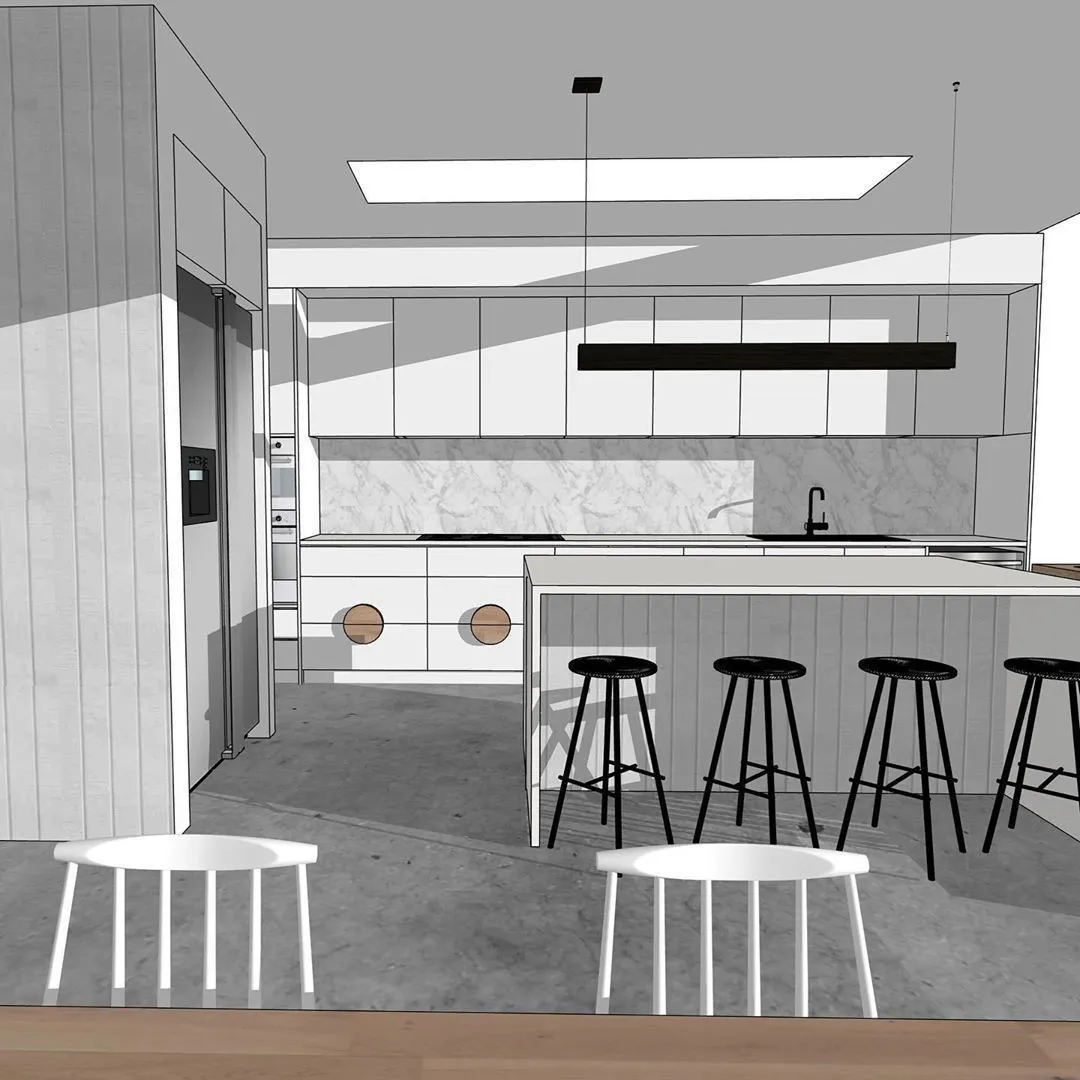
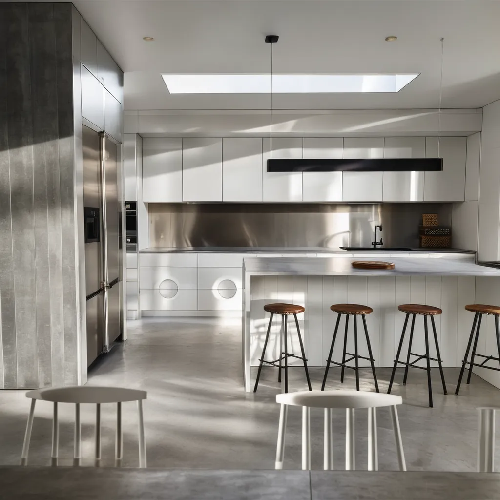
A cabinet swatch on the counter rarely answers the real question. Cabinet color changes the whole kitchen because it sits next to counters, backsplash, floors, appliances, daylight, and hardware. A kitchen cabinet color visualizer helps you compare those relationships before you repaint, reface, or specify new doors. The useful result is a focused visual preview, followed by real samples before any final color decision.
Start with your own kitchen photo
The fastest way to make a cabinet color decision clearer is to work from the kitchen you already have. In Render a House, our cabinet color visualizer starts with a kitchen photo, sketch, or render. You upload a JPG, PNG, or WebP image, describe the cabinet color change, add references when needed, and generate visual concepts you can compare.
That matters because cabinet color is context. A soft white can look clean beside warm wood floors and chalky beside cool quartz. A green that feels calm on a paint card can compete with a busy granite counter. A dark island can make the room feel intentional, or it can make the work zone feel heavy if the room has limited daylight.
Render a House is best for choosing the visual direction:
| Decision | What the visualizer helps you see | What still needs a real-world decision |
|---|---|---|
| Paint color | Overall tone, contrast, and room mood | Exact paint formula, sheen, and sample behavior |
| Stain or wood direction | Whether warm oak, walnut, or darker wood fits the room | Species, veneer, grain, finish schedule, and supplier sample |
| Two-tone cabinets | Balance between uppers, lowers, island, and tall cabinets | Shop drawings, refacing details, and product availability |
| Hardware with color | Whether black, brass, nickel, or wood details fit the palette | Hardware size, spacing, drilling, and finish durability |
| Client or household approval | A clear visual shortlist for discussion | Final specification, budget, lead times, and installation plan |
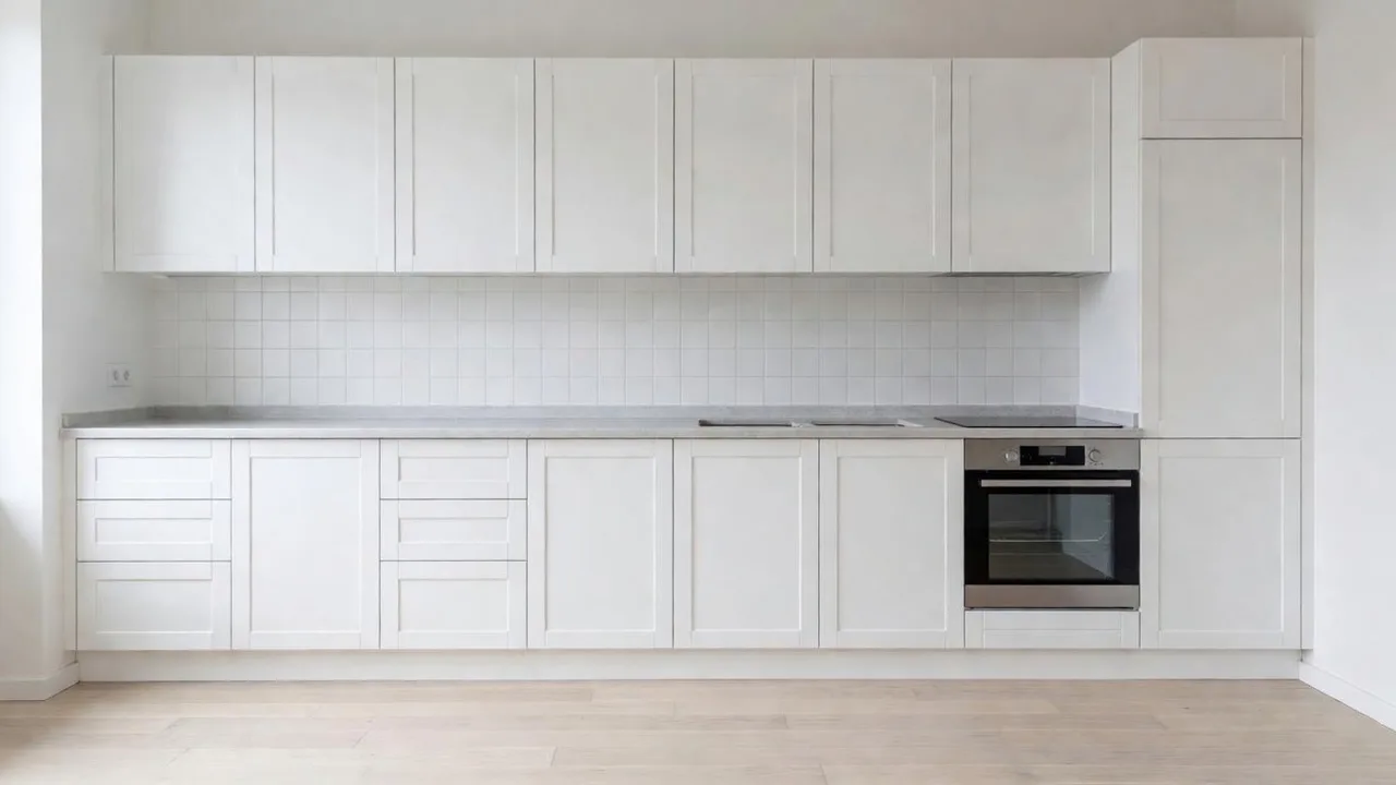
The preview should narrow the decision and leave the final color decision to the sample. Lighting changes how our eyes read color, and NIST's work on color perception is a good reminder that screen previews and physical samples answer different parts of the same decision.
What a cabinet color visualizer can actually decide
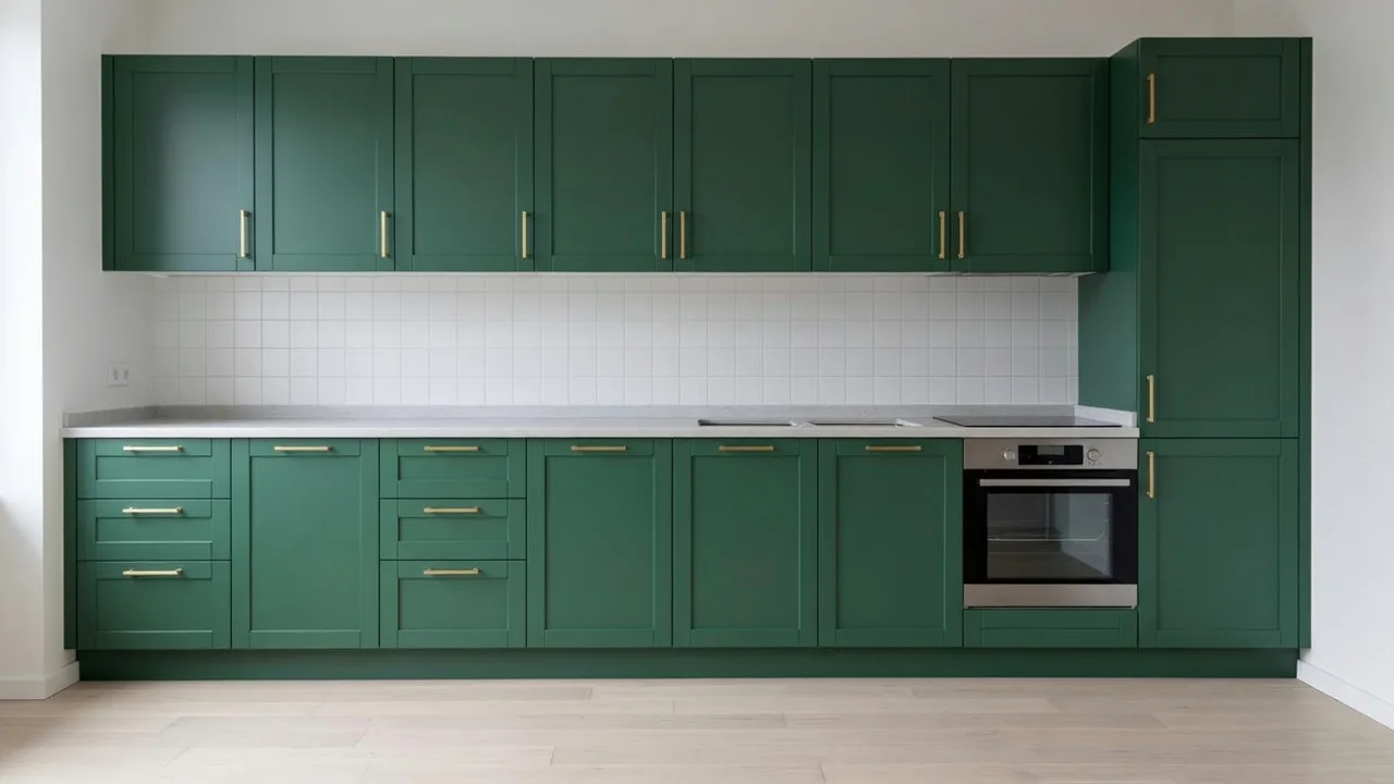
A cabinet color visualizer is strongest when the question is visual and comparative. It can show how the kitchen feels with warm white cabinets, sage green lowers, a navy island, matte black slabs, or a natural oak refacing direction. It can also show whether the fixed parts of the kitchen still work, especially counters, backsplash, floors, walls, appliances, and window light.
Use it for:
- Comparing light, medium, and dark cabinet directions in the same view.
- Testing painted, stained, natural wood, and two-tone cabinet ideas.
- Seeing cabinet color beside the finishes that will remain.
- Preparing two or three visual options for a client, partner, contractor, or design review.
- Checking whether a bold cabinet color should cover every cabinet or stay on an island or lower run.
Keep it out of decisions that require physical data:
- Exact paint brand matching.
- Color-accurate sheen, gloss, and texture.
- Cabinet dimensions, construction, hinges, and clearances.
- Quantities, cost estimates, and labor steps.
- Code, electrical, plumbing, ventilation, or structural decisions.
The best mental model is simple: the render is the shortlist tool. The sample door carries the final color decision.
How to use Render a House to preview cabinet colors
1. Photograph the kitchen like the cabinets are the subject
Start with the view that contains the cabinet run you care about. A wide, steady phone photo is usually enough.
Use these settings:
- Use the main 1x lens. Ultra-wide lenses can bend cabinet lines.
- Stand straight enough that vertical cabinet edges stay vertical.
- Include the counters, backsplash, floor, appliances, and any island that affects the decision.
- Turn on the lights you normally use and open blinds for natural light.
- Remove counter clutter, magnets, dish towels, and temporary objects that can confuse the cabinet edges.
- Avoid heavy filters, portrait blur, and strong HDR edits.
For image uploads, we accept JPG, PNG, and WebP files up to 5 MB. The supported file formats page gives the full upload reference, including recommended image dimensions.
2. Decide what must stay fixed
Before writing the prompt, list what should stay recognizable. This is the difference between a helpful cabinet color study and a generic kitchen makeover image.
Protect these fixed elements when they matter:
- camera angle
- cabinet layout
- island size and position
- counters
- backsplash
- flooring
- appliances
- windows and doors
- lighting direction
- hardware, when hardware is staying the same
Then write the color change as the only real variable.
A good first prompt is direct:
Keep the camera angle, cabinet layout, counters, backsplash, floor, appliances, window, and island position recognizable. Change only the cabinet fronts to a muted sage green painted finish with simple black hardware and soft natural daylight.
If the result changes the stone, swaps appliances, or moves the island, the prompt needs stronger fixed-element language.
3. Compare a small set of controlled versions
Three to five versions are usually enough for a first pass. More versions can make the decision feel less clear because every image starts competing on lighting, staging, and mood.
Use one base image and change one axis at a time:
| Round | Keep the same | Change only |
|---|---|---|
| Color family | layout, light, hardware | warm white, greige, sage, navy, charcoal |
| Depth | same color family | light, mid-tone, deep version |
| Placement | same color | all cabinets, lowers only, island only |
| Finish direction | same palette | painted, natural oak, walnut, matte black |
| Hardware | same cabinet color | black, brass, nickel, wood pull |
This turns the visualizer into a decision tool. If one image has sage cabinets, a new pendant, a different floor, brighter daylight, and fresh stools, you are no longer judging cabinet color alone.
4. Refine only the cabinet area when the concept is close
When the broad direction is right, use a more targeted edit. Render a House supports broad generation and localized edits. The Refine and Iterate guide explains when to generate a new version and when to edit a selected area.
For cabinet color, use a targeted edit when the kitchen already looks right and only one area needs correction. Select the cabinet run or island, then describe the selected area and the change:
The selected area is the island cabinet fronts. Change them to a deep navy painted finish. Keep the counter, sink, faucet, stools, floor, lighting, and perimeter cabinets unchanged.
Use a new version when the whole mood needs to change, for example going from a bright coastal look to a warmer modern wood kitchen.
5. Move from screen preview to samples
Once two or three directions survive the visual comparison, move to real samples. Paint and finish samples should be viewed beside the actual counter, backsplash, floor, and hardware. View them in morning light, daytime light, evening artificial light, and under-cabinet light if the kitchen has it.
That extra step is worth it because cabinet color covers a large vertical surface. A color that looks balanced on a phone can feel stronger once it appears across every door and drawer.
Cabinet colors worth testing first
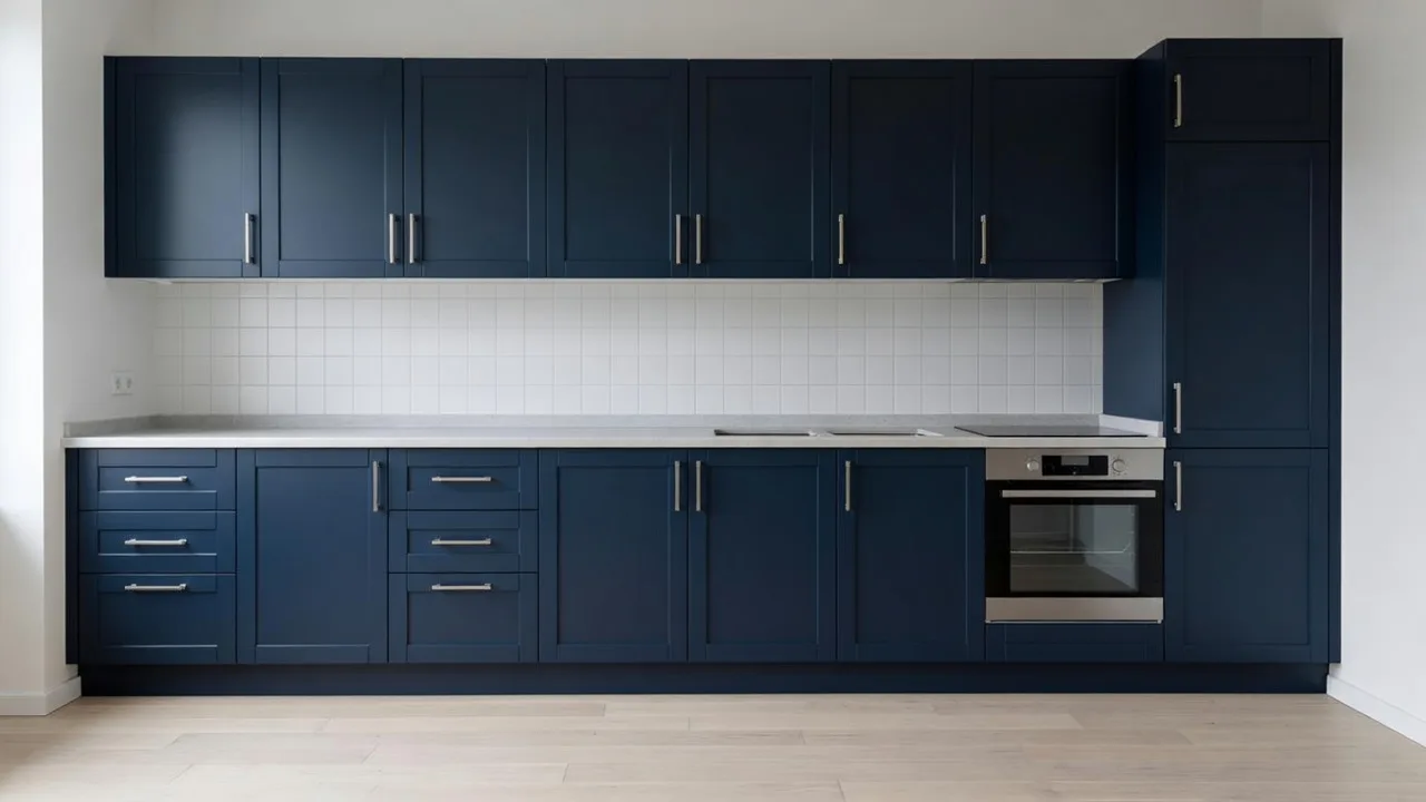
The safest shortlist starts with colors people already use in kitchens, then adapts them to your room. The NKBA's 2026 Kitchen Trends Report found that 96% of surveyed industry respondents identified neutrals as the most popular kitchen colors, with greens at 86% and blues at 78%. The same report said wood grain is growing in popularity, with white oak named as the most popular wood type.
Use that data as a starting point. Your counters and light still get the final vote.
| Color direction | Try it when | Prompt detail that helps |
|---|---|---|
| Warm white or soft greige | You want the kitchen brighter without a stark white look | Ask for warm white painted cabinets and keep counters and backsplash unchanged. |
| Sage or olive green | The kitchen has wood, cream, warm stone, or black accents | Specify muted sage, olive, or forest green and ask for natural daylight. |
| Deep blue or navy | You want contrast on an island, lowers, or a large wall of cabinets | Compare island-only and all-cabinet versions side by side. |
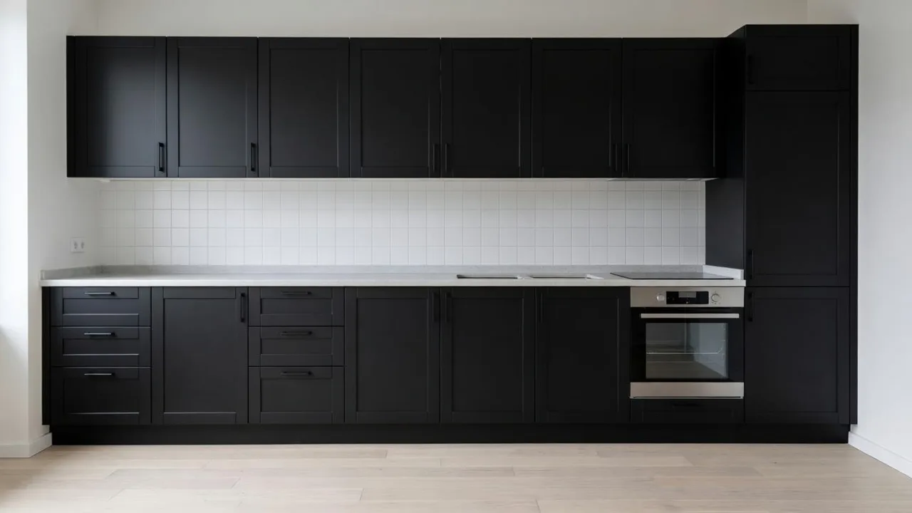
| Charcoal or soft black | The kitchen has enough daylight and light counters | Ask for matte or satin black, then judge whether the room feels too heavy. |
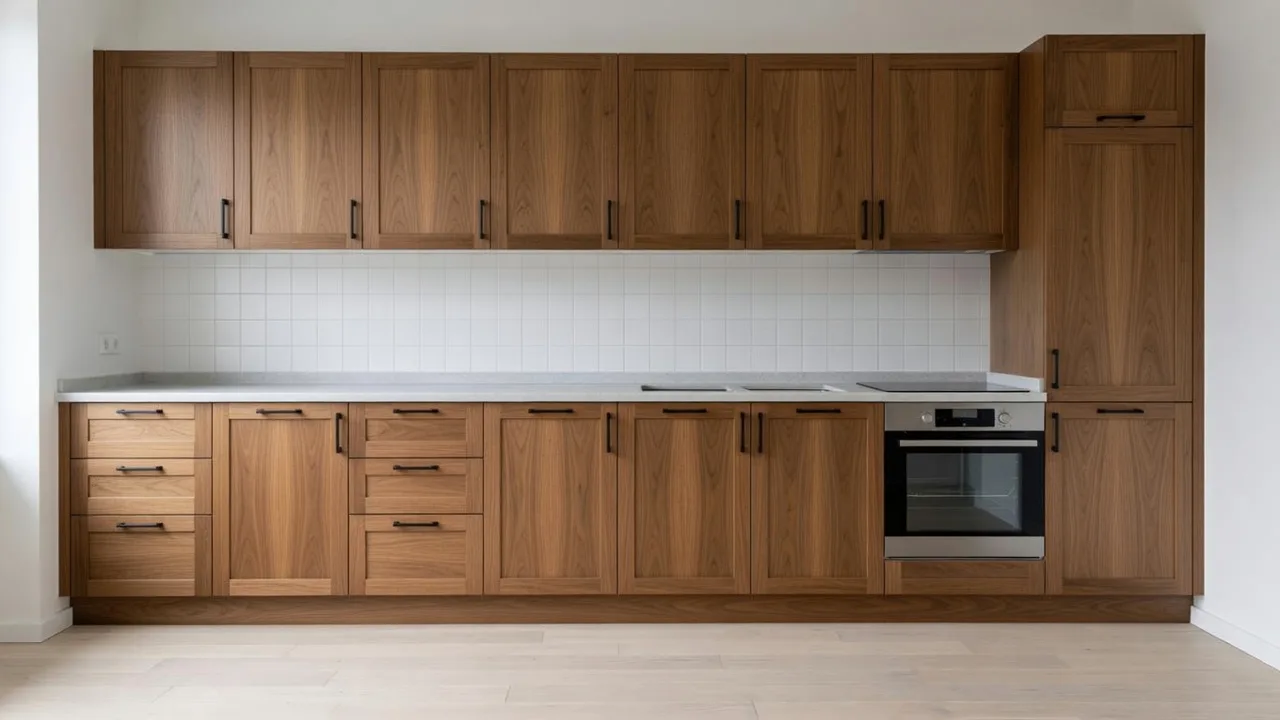
| Natural oak | You are considering refacing or warmer wood replacement | Add a reference image for the exact wood tone and grain direction. |
| Walnut or darker stain | You want warmth and depth with a premium feel | Keep flooring visible so the wood tones can be judged together. |
| Two-tone white and wood | You want a lighter room with some natural texture | Specify which cabinets are white and which are wood, especially the island. |
If the first render feels almost right and still slightly off, adjust warmth and depth before switching color families. For example, ask for “slightly warmer sage” or “a lighter greige with less yellow” before moving from green to blue.
Prompt examples you can copy
Use these as starting points. Replace the color, hardware, and fixed elements with your own kitchen details.
Warm white cabinet repaint
Keep the existing camera angle, cabinet layout, counters, backsplash, appliances, floor, window, and island position recognizable. Change all cabinet fronts to a warm white painted finish with satin sheen and simple brushed nickel hardware. Keep the kitchen realistic, softly lit, and uncluttered.
Sage green lowers with white uppers
Keep the kitchen layout, counters, backsplash, floor, appliances, and lighting unchanged. Change the lower cabinets and island to muted sage green paint. Keep the upper cabinets warm white. Use simple black hardware and preserve the original room proportions.
Navy island only
The island cabinet fronts are the only area changing. Make the island a deep navy painted finish with satin sheen. Keep the perimeter cabinets, counters, backsplash, stools, sink, faucet, floor, appliances, and lighting unchanged.
Natural oak refacing direction
Keep the camera angle, cabinet layout, counters, backsplash, appliances, floor, and island location recognizable. Change the cabinet fronts to natural white oak with a light matte finish and vertical grain. Keep the hardware minimal and the lighting natural.
Matte black modern cabinets
Keep the existing kitchen layout, counters, backsplash, floor, appliances, and window light. Change the cabinet fronts to a soft matte black finish with slim black pulls. Keep the result realistic and avoid changing the island size or appliance locations.
Greige cabinets with brass hardware
Keep the same kitchen view, counters, backsplash, appliances, floor, and cabinet layout. Change the cabinet fronts to a soft warm greige painted finish. Use understated brass hardware and keep the room bright with natural daylight.
Good cabinet prompts name the cabinet surface, the color family, the finish, the hardware, the fixed elements, and the lighting. Weak prompts rely on broad style words such as “modern” or “beautiful” and leave too many choices to the model.
How to choose the right kind of visualizer
Kitchen cabinet color visualizers fall into a few practical categories. The right choice depends on what you need to decide.
| Visualizer type | Best fit | Tradeoff |
|---|---|---|
| Cabinet brand catalog visualizer | You are buying that brand's cabinet doors or finishes | The color set and door styles usually stay inside that catalog. |
| Paint-code visualizer | You already have named paint colors to compare | The preview can still differ from real paint under your lighting. |
| General kitchen design visualizer | You want a broader remodel concept with counters, backsplash, lighting, and layout mood | It may change more than the cabinet color unless the prompt is controlled. |
| AI cabinet concept visualizer | You want to upload your kitchen and compare cabinet color directions quickly | It should be treated as visual planning before exact paint or cabinet specification. |
Render a House fits the last two needs. If the color question is part of a larger kitchen redesign, start with AI Kitchen Design. If the cabinet color is the main decision, start with the cabinet color visualizer and keep the prompt tight. For measured layouts and cabinet ordering, compare the best kitchen design software and planners.
Review every result before you trust it
A convincing render can still hide small changes. Before you share a version or use it to choose samples, compare it against the original photo.
Review these details:
- Cabinet door count and drawer count still match the original.
- Toe kicks, crown, fillers, and tall cabinet edges still make sense.
- Counters and backsplash stayed the same if you asked them to stay fixed.
- Appliances stayed the same size, color, and location.
- Hardware stayed consistent, with pulls and knobs in believable places.
- The island kept its shape and circulation space.
- Daylight and under-cabinet light still feel believable.
- The chosen color still looks good beside the fixed finishes.
If the cabinet color is right and a small area is wrong, select that area and fix it. If the overall kitchen changed too much, return to the original image and generate a new version with a stricter prompt.
A strong cabinet color choice starts with the room you already have. Upload your kitchen photo to our cabinet color visualizer, compare a small set of controlled options, and use the best preview to choose the real samples worth testing.