 Render a House/Updated Oct 18, 2026
Architecture Firm Website Design: Ideas, Must-Have Pages and Examples
A good architecture firm website is a project archive with a front door: six core pages, one consistent page per project, fast images, and a clear way to get in touch. This guide covers each page, how to structure project pages, when to use renders or photos, the speed and SEO basics, and which builders architects use. It also shows how to make a consistent image set for unbuilt work with Render a House, a browser tool that turns a 3D model, sketch or photo into a render.
Quick answer
An architecture firm website needs six pages: home, a projects index, one page per project, studio or people, services, and contact. Give every project page the same structure (lead image, title block, short summary, image sequence, drawings, credits), use photography for built work and clearly labeled renders for unbuilt work, keep the hero image under the 2.5-second Largest Contentful Paint target, and pick the builder your team will actually keep updated.
The rest of this article expands each of those points with tables you can copy into a brief for your designer or use as a checklist for a site you already have. Platform prices were checked on each vendor’s own pricing page in October 2026.
What pages does an architecture firm website need?
Most visitors to an architecture website are prospective clients, developers, competition juries, journalists and job applicants. They all want the same three things: to see the work, to understand who is behind it, and to find out how to make contact. These pages cover all three.
| Page | What goes on it | Avoid |
|---|---|---|
| Home | Who you are in one sentence, one lead image, three to six featured projects, a contact link. | Rotating sliders with no text; autoplay video with sound. |
| Projects index | Every published project as a grid with name, place, year and type; filters by sector or status once you pass about a dozen projects. | An unsorted wall of thumbnails with no labels. |
| Project pages | One page per project, with a fixed structure (see the next section). | Galleries that open in a lightbox with no text a search engine can read. |
| Studio / About / People | What the practice believes, how it works, the principals with real photos and short bios, awards and publications. | A mission statement that could belong to any firm. |
| Services / Expertise | What you design (residential, workplace, interiors, landscape), at what scale, and in which region. | A list of every service any architect could offer. |
| Contact | Office address, email, phone, a short enquiry form, and which project types and locations you take on. | Only a form, with no address or direct email. |
| News / Journal (optional) | Completions, competition wins, talks, and writing about the work. | A blog that stopped two years ago; remove it instead. |
| Careers (optional) | Open roles, how to apply, and what working at the studio is like. | A permanent “we are always hiring” line with no roles. |
Keep the main navigation to five or six items. Every large firm site reviewed for this article has Projects and Contact in its top-level menu. If a page would be empty or out of date, leave it out: a missing journal costs nothing, a journal that stopped in 2023 tells visitors the firm may have stopped too.
What should the homepage of an architecture website do?
The homepage has one job: get a visitor to the right project or to the contact page in one or two clicks. It is not where you explain your philosophy in full; that belongs on the studio page.
- One sentence of positioning. Say what you design and where. “Residential and workplace architecture in Denver” is more useful to a client than “We create meaningful spaces.”
- One lead image. Your strongest single image, sized for the screen and loaded first. A slow hero image is the most common reason an architecture site feels sluggish.
- Three to six featured projects. Each with a name, place and type under the image, linking to its project page.
- A visible contact path. An email address or a “Start a project” link in the header or footer of every page.
- Proof, briefly. Awards, publications or a client list, if you have them, as a single line or small row of names. Do not invent or round up.
Full-screen sliders that rotate every few seconds look impressive in a pitch and perform poorly in practice: visitors rarely see past the first slide, and each extra slide adds weight to the page. A single image with a clear project link does the same job faster.
How should an architecture project page be structured?
Project pages are where an architecture website is won or lost. They are the pages people share, the pages journalists and AI assistants quote, and the pages that rank for searches like “school architect in Portland.” Use the same structure for every project so a visitor learns where to look after the first one.
| Block | What to include |
|---|---|
| Lead image | One image that explains the project at a glance: the main exterior or the defining interior. |
| Title block | Name, city and country, year, program, size, status (built, under construction, concept), client if public, your role. |
| Summary | Two to four sentences: the brief, the idea, and the move that resolved it. This is the text search engines and AI assistants quote. |
| Image sequence | Approach, entry, main spaces, details, in the order a visitor would experience the building. |
| Drawings | A site plan, one or two plans, a section. Exported as images with real captions, not a PDF link. |
| Credits | Team, collaborators, consultants, photographer or visualization credit, and how each image was produced. |
| Next step | A link to related projects of the same type and to the contact page. |
Write the summary as plain text on the page, not inside an image or a PDF. A search engine cannot read a caption that only exists in a JPG, and a two-sentence summary like “A 40-unit timber housing block in Vancouver arranged around a shared courtyard” is exactly the kind of sentence that gets quoted. The same project structure works for a PDF portfolio; see how to build an architecture portfolio for the print version.
Give each project page its own URL, such as /projects/courtyard-housing-vancouver, a title tag with the project name and city, and a meta description that reuses the summary. Those three details matter more for search than any visual choice on the page.
Should an architecture website use renders or photos?
Use both, for different jobs. Photography proves a building exists; renders show what an unbuilt design will be. Most firms have more unbuilt work than photographed work at any given time, so a website that only shows built projects usually hides half of what the studio is doing.
| Image type | Use it for | Strength | Watch out for |
|---|---|---|---|
| Professional photography | Built projects; the lead image of a completed building | Proves the building exists; nothing else carries the same trust | Only exists after completion; a shoot costs money and needs good weather |
| Renders | Unbuilt, under-construction and competition projects; interiors not yet furnished | Show the design before it exists; you control light, season and camera | Must be labeled; inconsistent styles make a portfolio look like five firms |
| Drawings and diagrams | Every project page | Show how the building works; signal that the firm resolves buildings, not just images | Unreadable on a phone unless exported large and cropped well |
| Model photos and sketches | Process sections, competitions, the studio page | Show thinking and craft | Weak as a lead image on their own |
Two rules keep a mixed image set honest. First, label every render as a visualization in its caption or credits, and say which ones are AI-assisted. Second, replace renders with photography once a building is complete, and keep the renders further down the page as design-stage images. For a sense of the range of render styles and what each communicates, see architectural rendering examples.
How do you make project imagery look consistent?
Consistency is what makes a project grid look like the work of one firm. The usual problem is not quality; it is that every project was visualized at a different time, by a different person, in different software, with a different sky. The fix is to decide a house style once and apply it to every unbuilt project.
- Camera height. Eye level, about 1.6 m, for exteriors and interiors, unless an aerial view genuinely explains the site.
- Time of day. Pick one: soft daylight, overcast or dusk. Mixing them across the grid is what makes it look busy.
- Entourage. The same density of people, planting and cars in every view, or none at all.
- Aspect ratio. One ratio for lead images (for example 16:9 or 3:2) so the projects index lines up.
- Post-processing. The same color grade and contrast on every image.

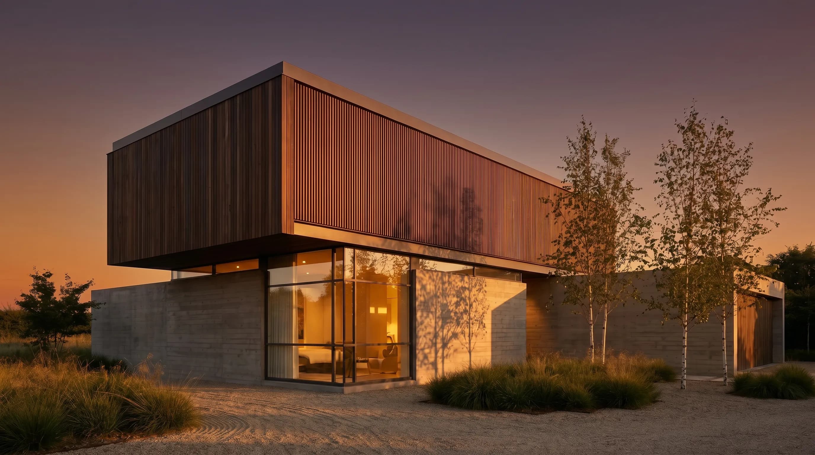
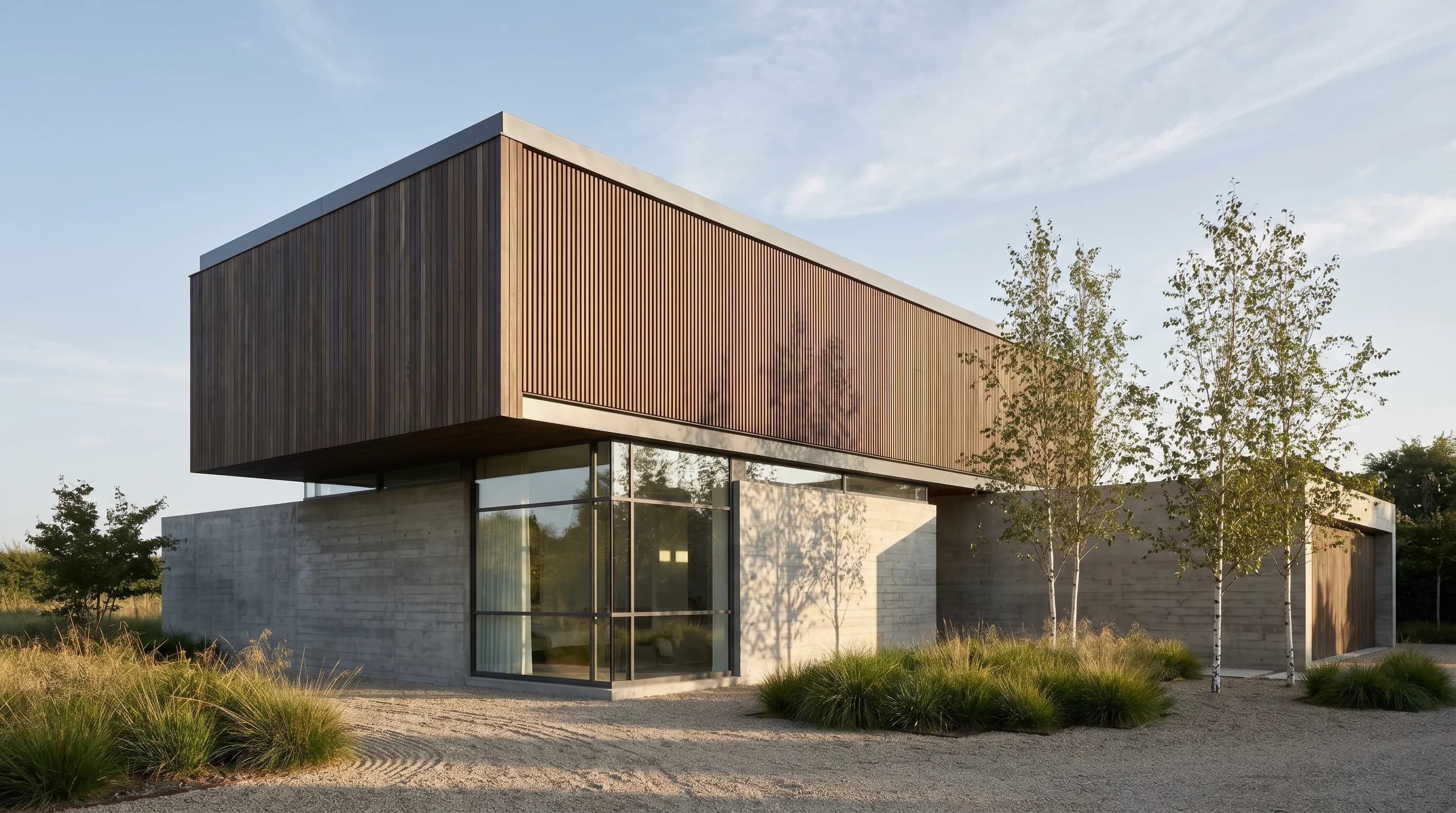
Step by step: one image set per project with Render a House
Render a House is an AI rendering tool for architects and real estate. It is not a CAD or BIM program: you design in your usual software and use it to make the images. The workflow below produces a matching set across several projects.
- Collect one source per view. Upload a SketchUp
.skpfile directly, or a GLB, GLTF, OBJ or STL model, and frame the camera in the browser. Sketches, elevations and site photos work as PNG, JPG or WebP images. For a plan saved as PDF, export the page to PNG or JPG first. - Write the house style once. Describe the light, season, entourage and mood in plain words, for example “soft overcast daylight, light planting, two people at the entrance, no cars,” and reuse the same description for every project.
- Render the lead image first. A render takes about 30 to 60 seconds. Check openings, structure and materials against your drawings, and edit or regenerate anything that does not match the design.
- Make the variants. Change one thing at a time, such as dusk instead of daylight or a different facade material, using the approach in how to create render variations.
- Export at web size. Wide enough for a full-width hero on a large screen, then compress to WebP before uploading to your site builder.
- Caption and credit. For example: “Visualization, AI-assisted, from the design model. Materials and planting illustrative.”
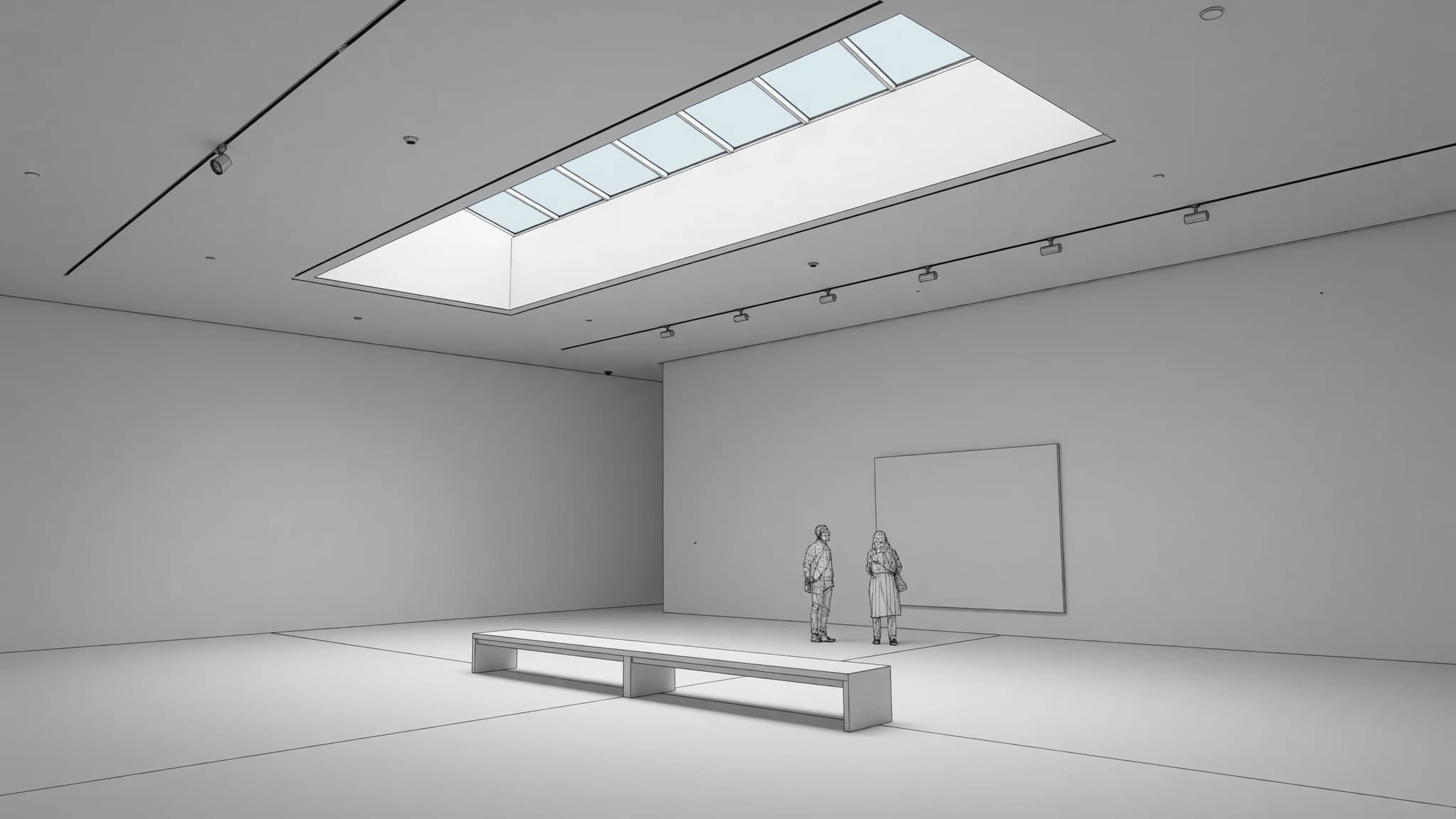
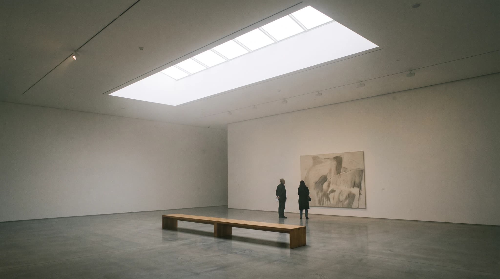
The Free plan gives 3 credits a day at 1K resolution with a watermark and needs no card, which is enough to test a house style on one project. For website-quality images without a watermark, paid plans start at $19/month (Basic) and $39/month (Pro), billed monthly; video is on paid plans only. Use the render cost calculator to estimate a full site’s worth of images, or start from architectural rendering.
How fast should an architecture website be, and what SEO matters?
Architecture sites are image-heavy, so speed problems are almost always image problems. Google’s Core Web Vitals give three concrete targets, measured at the 75th percentile of page loads on mobile and desktop, per web.dev Web Vitals (checked October 2026).
| Metric | Good threshold | Usual culprit on a portfolio site |
|---|---|---|
| Largest Contentful Paint (LCP) | 2.5 seconds or less | Your hero image. Serve it as WebP or AVIF, sized for the screen, not a 6,000-pixel original. |
| Interaction to Next Paint (INP) | 200 milliseconds or less | Heavy gallery scripts, sliders and chat widgets. Remove what you do not need. |
| Cumulative Layout Shift (CLS) | 0.1 or less | Images without width and height, late-loading fonts and cookie banners that push content down. |
The SEO basics that matter most for a firm site:
- One URL and one title per project. “Courtyard Housing, Vancouver | Studio Name” beats “Project 07.”
- Text on every project page. A summary and title block in HTML, not only images.
- Your address and service area. On the contact page and in the footer. Google documents LocalBusiness structured data for business details such as address and opening hours.
- Internal links. Link each project to related projects and to the relevant service page.
- Mobile first. Check every project page on a phone, including image crops and drawing legibility.
Image SEO for project galleries
Per Google’s image SEO best practices (checked October 2026), alt text is the most important attribute for describing an image, Google also reads captions and nearby page text, and short descriptive filenames give it light extra clues.
- Alt text: describe the view, for example “Courtyard of a timber housing block at dusk,” not “architecture firm Vancouver best architect.”
- Filenames:
courtyard-housing-vancouver-dusk.webp, notIMG_4021.jpg. - Captions: real text under images on project pages, including the visualization or photographer credit.
- Responsive images: serve smaller files to phones and always keep a fallback
src.
Which website builder should an architecture firm use?
All of the platforms below can host a good architecture website; the right one depends on who will maintain it. Prices are from each vendor’s own pricing page, checked October 2026, in USD before tax. Vendors change prices and run promotions often, so confirm on the linked page.
| Platform | What it is | Entry price (checked Oct 2026) | Fits |
|---|---|---|---|
| Squarespace | Template-driven builder; hosting included; 14-day free trial | Basic $19/month billed annually or $25/month billed monthly; Core, Plus and Advanced above it, per Squarespace pricing | Small studios that want a clean grid portfolio with little upkeep |
| Wix | Drag-and-drop builder with a free plan; agency product sold separately as Wix Studio | Free plan; paid plans from Light at $17/month, prices shown for yearly subscriptions, per Wix plans | Firms that want free-form layouts without code |
| Webflow | Visual builder with a CMS; free Starter plan on a webflow.io domain | Basic $15/month and Premium (with CMS) $25/month, both billed yearly, per Webflow pricing | Firms with a designer who wants full layout control and a project CMS |
| WordPress.com | Hosted WordPress with themes and, on paid plans, plugins | Personal shown at $4/month for the first year billed annually, renewing at $5/month; Premium, Business and Commerce above it, per WordPress.com pricing | Firms that publish a lot (journal, news) and want plugins |
| WordPress (self-hosted) | Open-source software (GPLv2) you install on your own hosting | Software is free; hosting, theme and developer time are separate, per WordPress.org | Larger firms with a developer or agency on retainer |
| Format | Portfolio builder aimed at photographers and creatives; 14-day trial, no card | Basic, Pro and Pro Plus billed annually; the page showed a limited-time discount, so check current prices on Format pricing | Image-led solo practices and designers |
| Cargo | Site builder for designers and artists; one price, no tiers | $14/month billed yearly, one custom domain included, per Cargo information | Experimental, typographic studio sites |
A quick way to choose:
- No designer in-house, little time: Squarespace, Format or Wix. Start from a grid template and resist customizing it into something you cannot maintain.
- A designer who wants control: Webflow, or Cargo for a more experimental site. Set up a project collection so adding a project is filling in fields, not building a page.
- Lots of publishing, developer support: WordPress, hosted or self-hosted. Budget for maintenance, not just launch.
Whichever you choose, the content model is the same: a project type with the fields from the project page table above. If a platform makes that hard, it is the wrong platform for an architecture firm.
What do real architecture firm websites have in common?
Rather than describe imaginary sites, here is what the navigation of four well-known practices actually shows, checked on each site in October 2026. The pattern is consistent, and none of it depends on budget.
- Snøhetta: the menu leads with People, Process and Projects, then News, About, Sustainability, Perspectives, Contact and Studios, and splits work by discipline (architecture, landscape, interior, product).
- Foster + Partners: a short header of Projects, Expertise, Studio, News, Careers and Contact, with a news-led homepage.
- SOM: Projects, Ideas, People, News, About and Contact, with projects browsable by expertise such as residential, workplace, higher education and adaptive reuse.
- Studio Gang: Projects, Publications, Now and About, with projects split into architecture, planning, interiors and exhibitions, and a one-line description of the practice and its offices on the homepage.
What they share, and what a small firm can copy directly:
- Projects is a top-level menu item on every one.
- Work is filterable by type, discipline or sector.
- People and studio pages are separate from projects.
- Contact is a top-level item, never buried.
- The navigation is short; depth lives inside sections.
Architecture website design ideas worth stealing
Website design ideas that suit architecture specifically, rather than any small business:
- A filterable project index. Filter by sector, scale, status or location. A client looking for a school architect should see schools in one click.
- Status labels. Mark projects as built, under construction, in design or competition. It explains why some use renders and gives visitors a reason to come back.
- Before and after for renovation work. Pair the existing photo with the proposed render or the completed photo.
- Drawings as design elements. A clean section or axonometric often reads better on a phone than a wide exterior.
- A map of projects. Useful for firms with a strong regional practice; skip it if your projects are spread thinly.
- A process page. How a project runs from first meeting to handover, with fees explained in general terms if you are comfortable doing so.
- Short project videos. A ten-second camera move on the project page, muted and not autoplaying with sound. See 3D model to AI video walkthrough for a way to make one from a model.
- Typography and white space over effects. Let the images carry the page; skip parallax, cursor effects and loading animations that delay the first image.
What a good website and good renders cannot do
A well-designed site makes good work easier to find; it does not replace the work, the relationships, or the honesty of how the work is shown.
- Renders are not built work. A render shows design intent. Do not present a visualization in a way that implies a building is complete, and do not show projects you are not permitted to publish.
- AI renders are not construction documents. They can add or simplify details. Check every image against your drawings, and treat materials and planting as illustrative unless you specified them.
- A template is not a brand. Builders make launch easy; making the site feel like your practice still takes decisions about type, image style and writing.
- SEO is slow. New project pages can take weeks to appear in search, and no change guarantees a ranking.
Common questions about architecture websites
What pages should an architecture firm website have?
- Six core pages: a home page, a projects index, one page per project, a studio or about page with the people, a services or expertise page, and a contact page with an address. News and careers are optional; remove them if you cannot keep them current.
What is the best website builder for architects?
- There is no single best one. Squarespace and Format suit small studios that want a clean grid with little upkeep; Webflow suits firms with a designer who wants a project CMS; WordPress suits firms that publish a lot and have developer help; Cargo suits experimental studio sites. Pick the one your team will actually update.
Can I use renders on my architecture website?
- Yes. Renders are the normal way to show unbuilt, competition and under-construction projects. Label them as visualizations, keep one consistent style across projects, and replace them with photography once a building is complete.
Is an architecture portfolio the same as a firm website?
- No. A portfolio is usually a curated PDF for an application or a pitch; a firm website is a permanent, searchable record of the practice. They share project content, but the website needs one page per project, a contact path and basic SEO.
How many projects should an architecture website show?
- Publish every project you are proud of and allowed to show, but feature only three to six on the home page. Past roughly a dozen projects, add filters by sector, scale or status so visitors can find relevant work.
How do architecture firms get found on Google?
- Give each project its own page with a real title, city and summary text; describe images with alt text; keep pages fast against Core Web Vitals; and publish your address and service area. Google documents LocalBusiness structured data for business details.
Have unbuilt projects with no website-ready images? Upload the .skp, a model export or a sketch, write your house style once, and render the first lead image with Render a House.
Related guides:
- Architecture portfolio — the PDF version of your project pages, with a free template.
- Architectural rendering examples — render styles and what each one communicates.
- Rendering styles — pick a house style for your project images.
- Home builder marketing — renders for listings and pre-sales.
- Architectural visualization guide — the visualization workflow from model to presentation.
- Render cost calculator — estimate what a full set of project images costs.
Keep reading
Related guides and comparisons
3D Printing Architectural Models: Printers, Materials and Workflow
How to 3D print architectural models: scale, wall thickness, STL export from SketchUp, Revit and Rhino, slicing, FDM vs resin, materials and finishing.
The Architectural Design Process: Phases From Brief to Construction
The architectural design process runs from programming through schematic design, design development, construction documents, bidding and construction.
Architectural Styles Explained: 22 Styles and How to Recognize Them
22 architectural styles from Classical to Tropical Modernism: dates, 3-4 features to spot each one, a canonical example building and a summary table.
